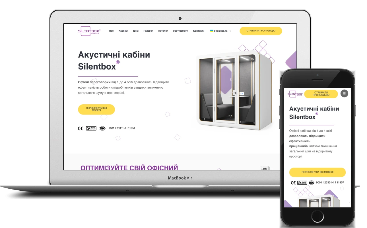
Nobody buys an acoustic pod on impulse: it is chosen by size, sound insulation, ventilation and how it will fit into the office. A good manufacturer website answers these questions before the customer picks up the phone – and in their own language. Here is how I built such a website for Silentbox®.
The brief: one website for buyers from two dozen countries
Silentbox® is a Polish-Ukrainian manufacturer of acoustic office pods: from the single-person Solo for calls to the Quartet, where four people can hold a meeting. The company is headquartered in Wrocław, and according to the client its pods are in use in offices in 25 countries. That means the site is read by office managers, executives and interior designers from all over, and each of them needs to understand the models quickly, see a pod in their office colours and get a price.
Hence three main requirements: plenty of languages without a separate site for every country, a clear way to choose the model and colour, and a short path from interest to enquiry.
Structure: a presentation-style home page and model pages
The home page is built as a detailed presentation with an anchor menu: “About the pods”, “Pods”, “Prices”, “Gallery”, “Catalogue”, “Certificates”, “Contact”. Visitors can read it from top to bottom or jump straight to the section they need.
- the first screen – pods for one to four people and a “View all models” button
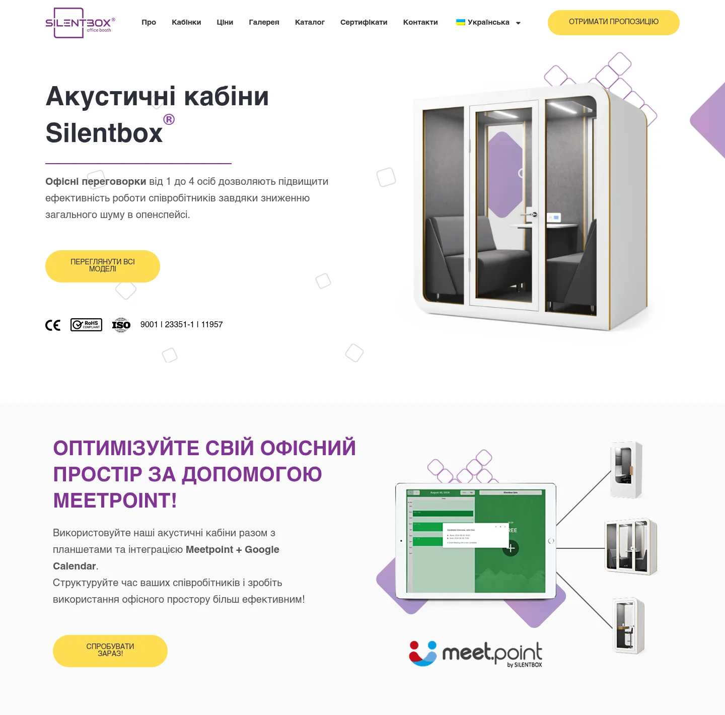
- eight technical blocks: up to 35 dB of sound insulation, no echo, ventilation of up to 30 m³ per hour, silencers, three-layer laminated glass, LED lighting, a socket with USB and a presence sensor
- a “What does noise cost your office?” block with research figures and links to the sources
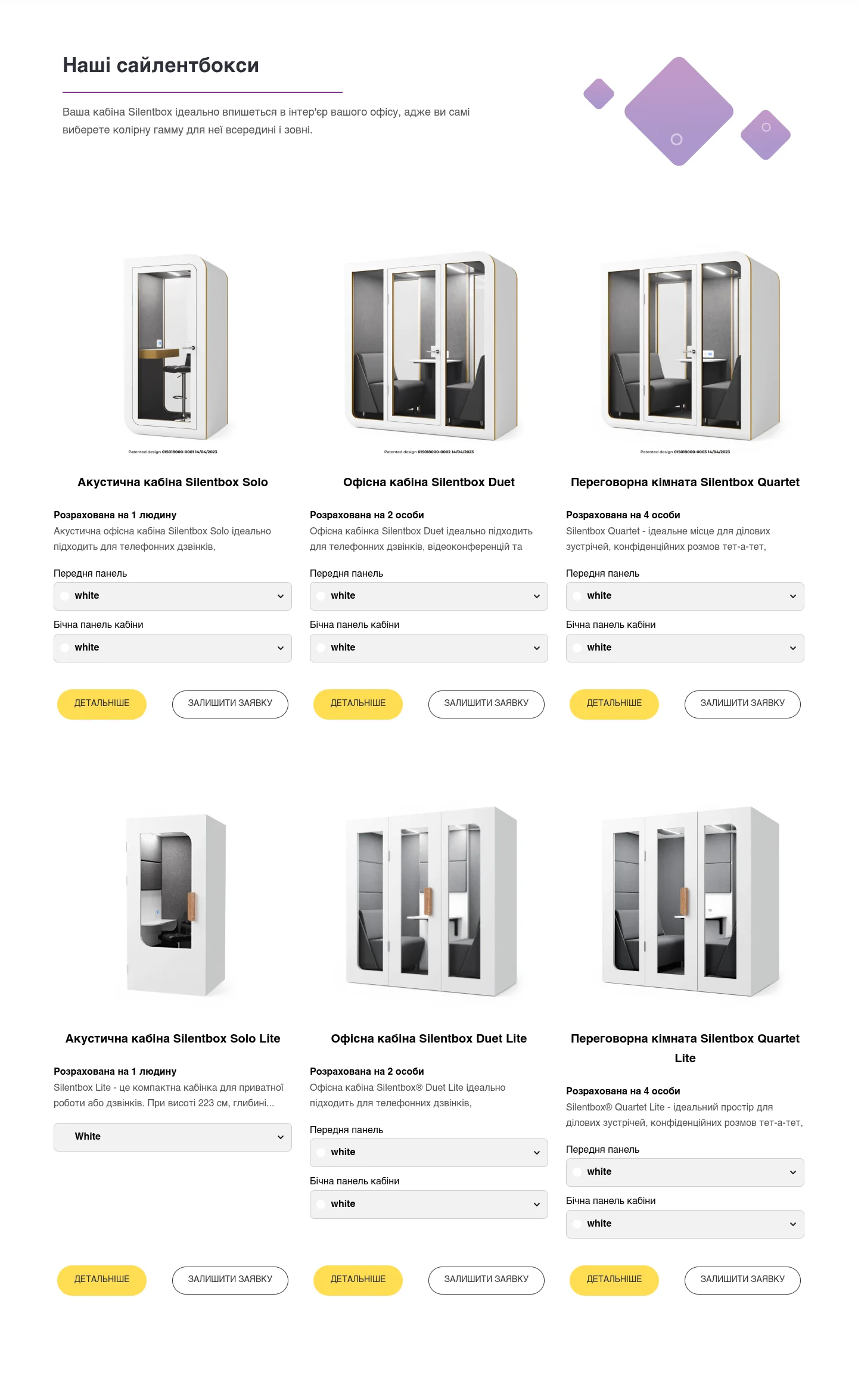
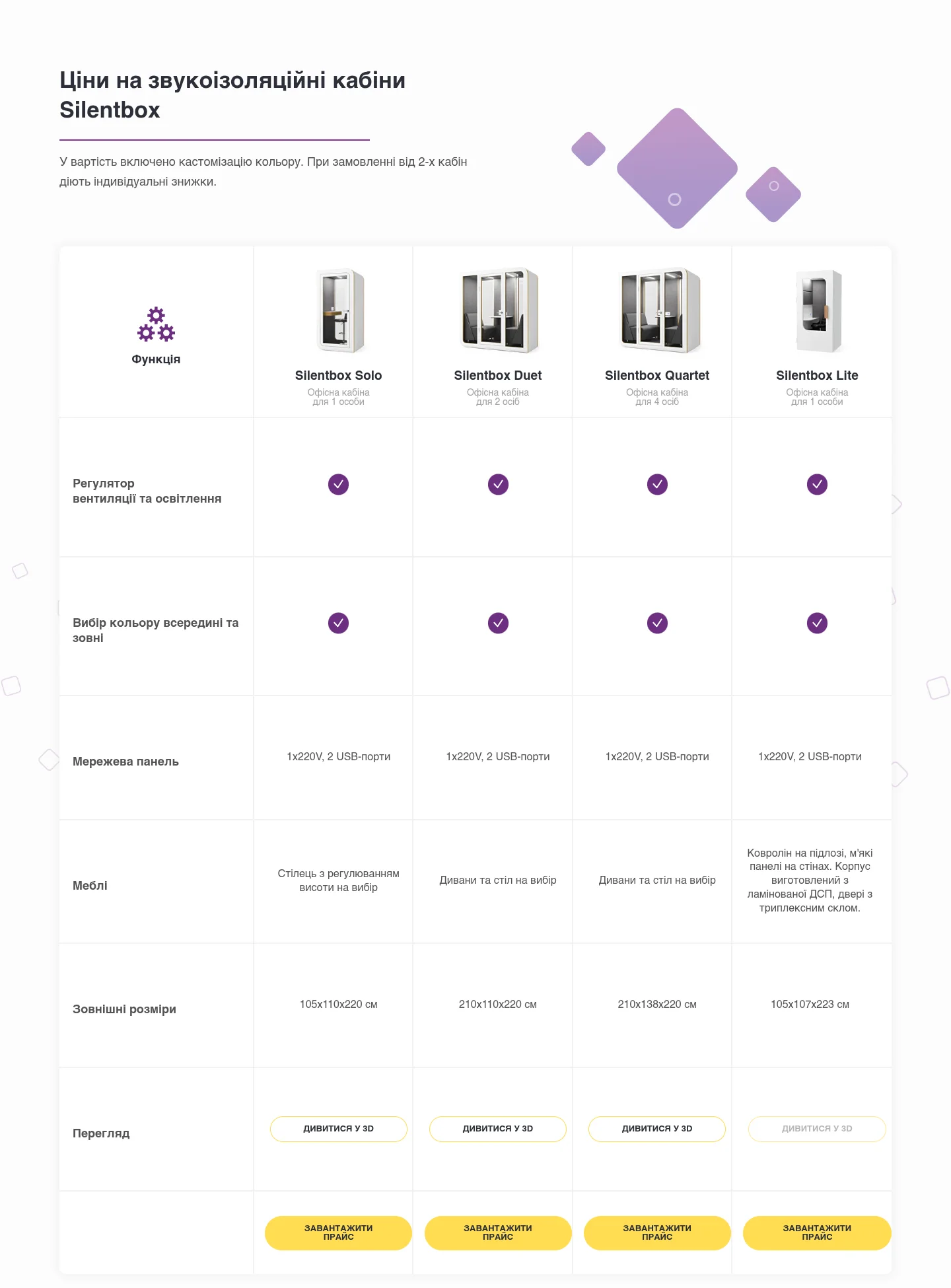
- cards for the six models, a teaser for the new WorkPod, a comparison table and a 3D view
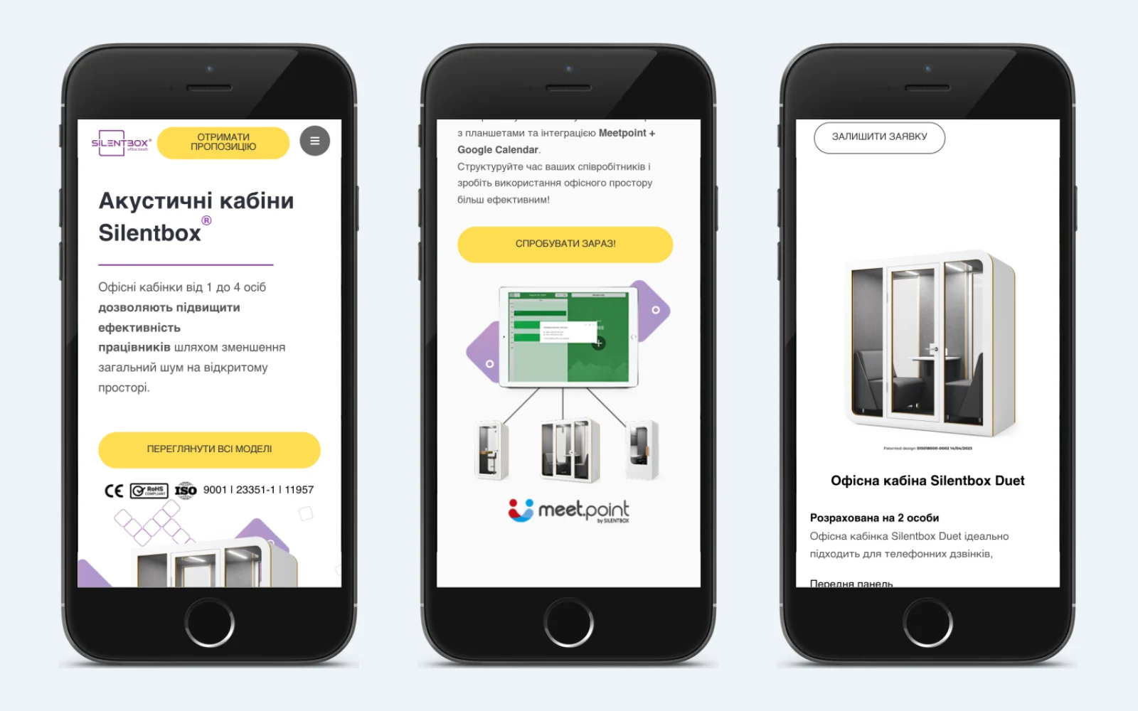
- a block about Meetpoint – Silentbox®’s own service for booking pods via tablets and Google Calendar, with a link to its website
- a gallery, a PDF catalogue, reviews, FAQs, news and the headquarters’ contact details
Each pod – Solo, Duet, Quartet and the three models in the Lite series – has its own page: photos, a description, technical specifications, dimensions, “Download price list” and “View in 3D” buttons, and similar models at the bottom.
Choosing the colour right on the product page
A pod is a long-term purchase, and it has to fit into the interior. That’s why the product page has two drop-down lists: the front panel colour (white, grey, black) and the side panel colour (seven options, from white to yellow, red and blue). For this, I wrote a custom pod page template in the Astra child theme and a small script: when the colours are chosen, the photo switches to the matching combination – and one model alone has 21 of them.
The Lite series works differently: instead of colours, the customer chooses one of ten prints shown as preview images. When the page loads, the first option is selected automatically, so the product page is never left without a photo. The order button remembers the model: the pod’s page URL is sent with the enquiry form, so the sales manager doesn’t need to ask which pod the customer means.
Model comparison and 3D view
To save visitors from clicking from page to page, the home page has a comparison table: capacity, ventilation and lighting controls, power panel, furniture and external dimensions – from 105×110×220 cm for the Solo to 210×138×220 cm for the Quartet. The “View in 3D” and “Download price list” buttons for each model are right there too.
Solo, Duet and Quartet have separate pages with an interactive 3D model: you can rotate the pod and look at it from every side. The models themselves are embedded from Vectary, and the pages use a dedicated template that places the description and specifications next to the model.
21 languages on one website
The translations run on TranslatePress. Each language has its own folder in the URL and correct hreflang tags, so search engines show people the right version. The switcher offers 21 languages: Ukrainian, English, Polish, German, French, Spanish, Italian, Dutch, Czech, Japanese and more. The Arabic and Hebrew versions read from right to left, as they should.
The forms take the language into account too: the page language is sent along with each enquiry, and the phone field lets visitors pick their country code, so nobody has to guess how to format an international number.
Forms and the path to an enquiry
Someone buying a pod is rarely ready to order straight away – first they want a price and a presentation. That’s why the site collects enquiries in several places:
- a “Get a quote” button in the header of every page
- “Download price list” on the product cards and in the table – it opens a pop-up form to request the PDF presentation and price list
- “Send a request” on the model page
- a request to trial a pod
- a form in the contact section
All the forms are built with Elementor Pro and ask only for a name, e-mail address and phone number. Under each form there is a promise to reply within an hour, so customers know what to expect.
Trust: certificates, reviews, gallery and blog
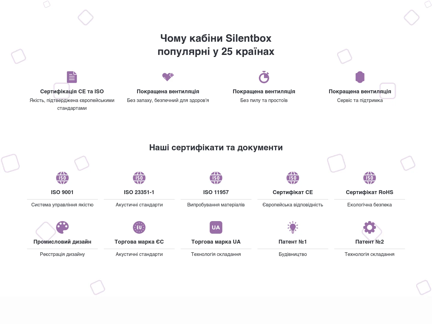
When a company is buying, trust matters more than fine words. The site brings the documents together: ISO 9001, ISO 23351-1, ISO 11957, CE, RoHS, an industrial design registration, EU and Ukrainian trademarks and two patents. Alongside them are 14 client company logos, reviews and a warning not to confuse Silentbox® pods with counterfeits.
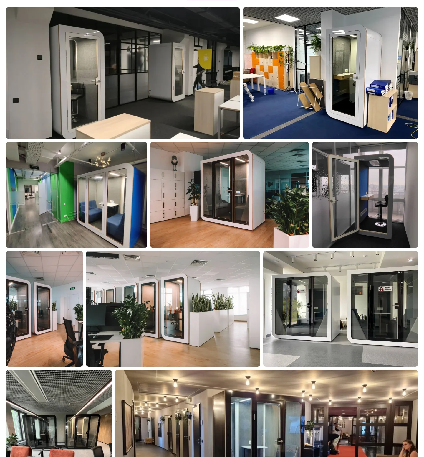
A separate gallery page with 74 photos shows the pods in real offices, and the blog’s 11 articles cover how to choose a pod, an installation in Vilnius, the company’s place in a Forbes ranking and its contract with NATO. These are arguments for buyers and, at the same time, texts that help the site get found in search.
What matters on an office equipment manufacturer’s website
Office pods, furniture, partitions and lighting are bought by companies. Several people are involved in the decision, they compare offers and nearly always ask for a price list before talking to a salesperson. From the experience of this project, a website for such a manufacturer should:
- speak the buyer’s language – a switcher alone isn’t enough; each version needs its own URL and the right markup for search engines
- show the product clearly: photos in every colour, 3D, dimensions and specifications in one table
- provide the documents – for a purchasing department, certificates and patents carry more weight than slogans
- turn interest into contact: a price list and presentation in exchange for a name and e-mail is a fair deal for a business buyer
- pass the enquiry to the sales manager together with the model and the customer’s language
If you are a manufacturer or distributor selling to several countries, don’t start with the pictures – start with the structure: which models, which languages, what questions buyers ask. The website is built around that, and with WordPress and Elementor it can be set up so that your team edits the texts and adds new models themselves.
Project details
Project typemultilingual catalogue website
CategoryBusiness website
TechnologiesWordPress, Elementor Pro, Astra (child theme), TranslatePress, Yoast SEO, PHP, JavaScript (jQuery), Vectary (3D models)
Rolewebsite development: structure, model page templates, colour picker, multilingual set-up, forms
ClientSilentbox®
CountryPoland, market: Europe
What was done
- Planned a presentation-style home page with an anchor menu and sections on the pods, prices, gallery and certificates
- Created custom templates for the pod pages and the 3D view in the Astra child theme
- Wrote the front and side panel colour picker that swaps the photo for each combination
- Separately built print selection with previews for the Lite series
- Put together a model comparison table with dimensions, features, 3D and the price list
- Added 21 languages with TranslatePress, including right-to-left Arabic and Hebrew
- Set up Elementor Pro forms: price list and presentation, quote, pod trial, phone field with country code
- Built a 74-photo gallery page, a certificates section and a blog
Result
- One website in 21 languages instead of a separate version for each country
- Buyers choose the pod colour themselves and see the result on the photo straight away
- All six models come with specifications, dimensions and a comparison, and the three main ones with a 3D view
- Every “Download price list” button leads to an enquiry with the customer’s contact details
Visit the project website