When you sell an éclair course, your strongest argument is the éclairs themselves. Using pastry chef Maria Tulchevska’s online school as an example, I explain how I built a website in English: a home page with the courses and their author, a course sales page with video and a module-by-module syllabus, and the mobile version.
About the client and the brief
Maria Tulchevska is a pastry chef and the founder of Art Dessert LLC. Her California company makes European desserts and pastries, works with local coffee shops and runs professional pastry classes online and in person across the United States. Maria has personally taught more than two hundred students.
The online school ART DESSERT by Maria Tulchevska needed a website in English to sell its courses – one on éclairs and one on cake. The flagship is “Contemporary Éclairs”, which promises that you can learn to make professional-quality éclairs even with no baking experience. My job was to make a website that makes this promise believable at first glance: build the home page and the course page, and put together the interactive blocks and the mobile version.
How the site looks: desserts, graphite and gold
Maria’s éclairs look like pieces of jewellery in their own right: mirror glaze, gold leaf, berries. So the site doesn’t compete with them through decoration – the photos take the lead:
- desserts on a clean white background – large, with cross-sections of the fillings and reflections
- three colours: graphite, sandy gold and white – like the window of an upmarket patisserie
- a fine, high-contrast typeface for headings in capitals, and italics for captions such as “online course”
- pill-shaped buttons with a black-to-gold gradient – one consistent signal for actions on every page
- fine hexagon outlines as a recurring motif – from the blocks on the course page to the logo in the footer
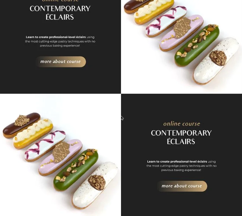
Most pages are built in a chequerboard pattern: a photo with text alongside on a dark or gold panel. This rhythm is easy to read, and the grid is easy to extend with new sections – a cake course page, for example.
Home page: the author and the courses from the first screen
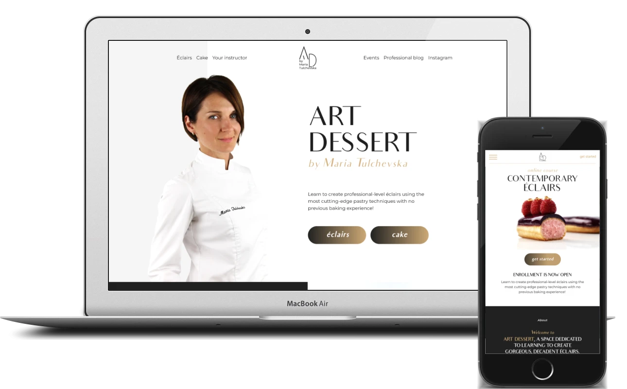
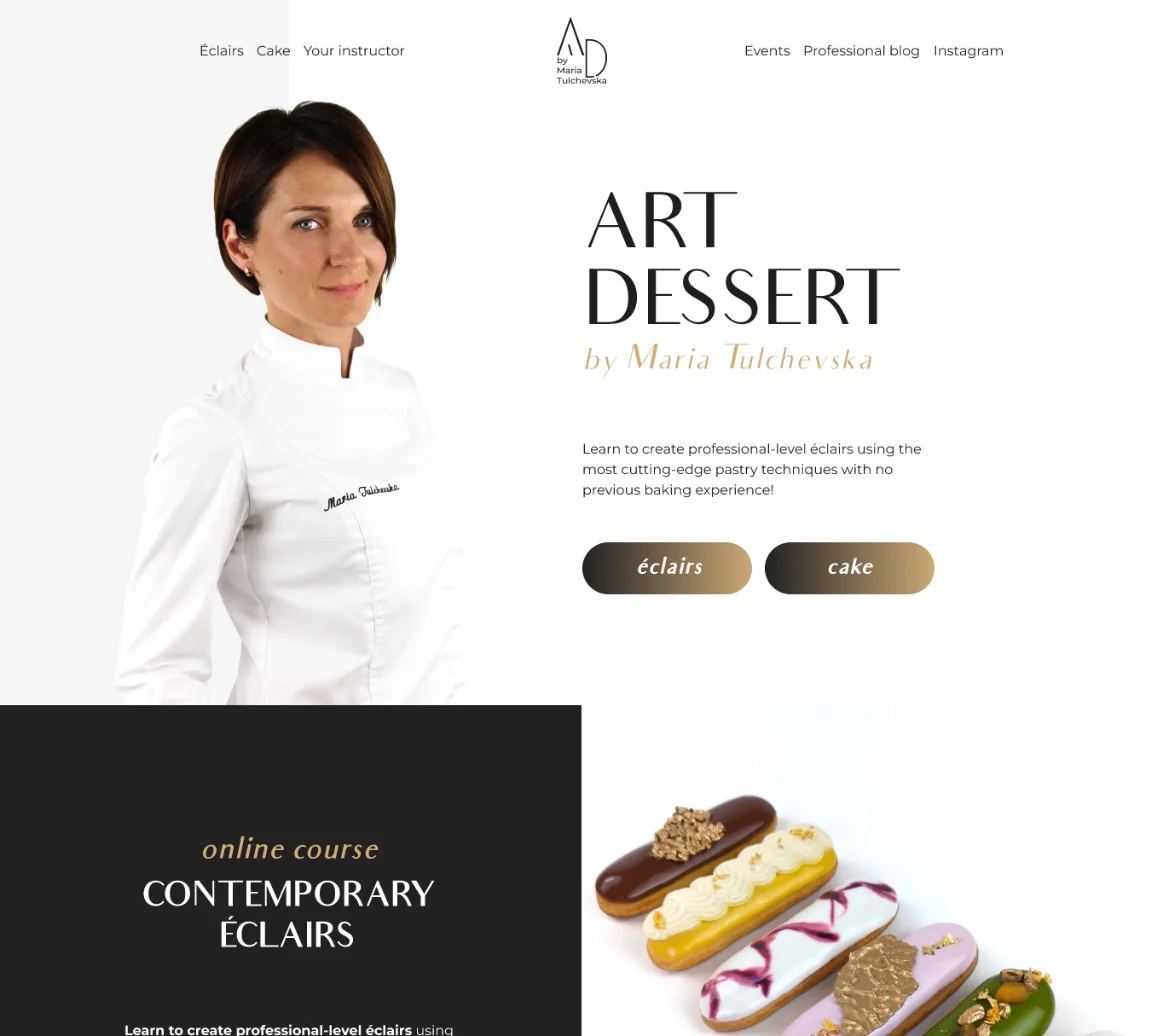
The header menu is split by the monogram logo: “Éclairs”, “Cake” and “Your instructor” on the left, “Events”, “Professional blog” and Instagram on the right. The first screen shows Maria in a chef’s jacket, the name of the school, a short promise to teach professional-quality éclairs with no baking experience and two buttons – “éclairs” and “cake”. Visitors choose a course before they have even scrolled.
Further down, the courses are presented in chequerboard blocks: photos of desserts next to a dark panel with the caption “online course”, the title, a description and a “more about course” button.
Meet the instructor
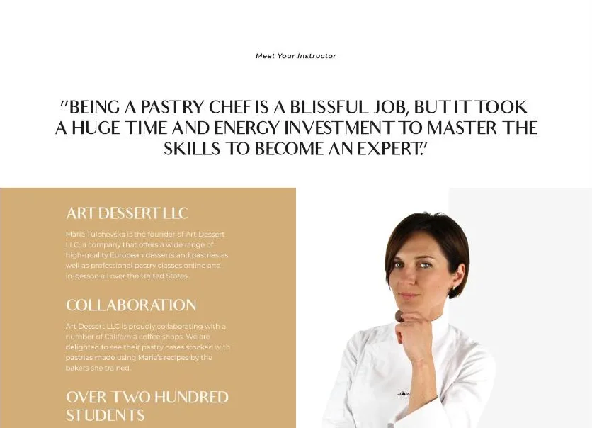
In online learning, people buy the teacher as well as the curriculum. The “Meet Your Instructor” block opens with a large quote from Maria about how much time and effort it took her to master her craft. Next to her portrait is a gold panel with three facts: her company Art Dessert LLC, its partnerships with California coffee shops that sell pastries made to Maria’s recipes, and more than two hundred students.
Then comes a full-width strip of halved éclairs with a reflection, followed by the mission block: Maria holding an éclair and a quote about how much she enjoys sharing her knowledge and making contemporary pastry techniques accessible to everyone. A “more about Maria Tulchevska” button leads to her full story, and the dark footer brings together the menu, logo and contact details.
Course page: from “enrolment open” to video
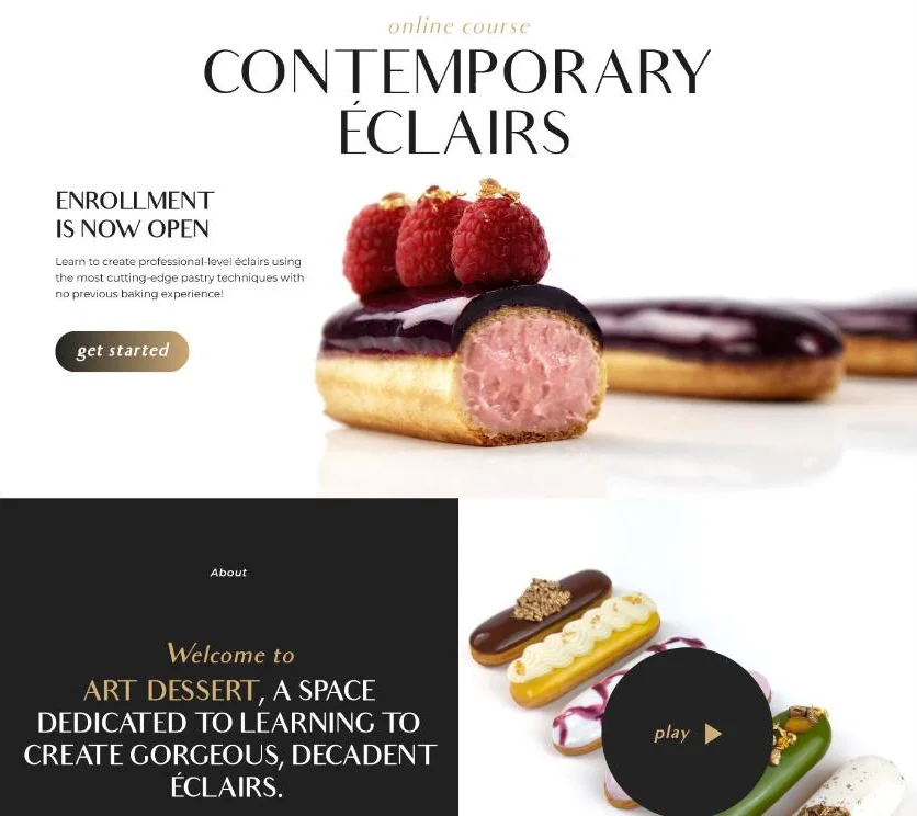
The “Contemporary Éclairs” page is built as a sales story. The first screen has the course title, the line “Enrollment is now open”, the promised result and a “get started” button next to a large photo of a raspberry éclair cut in half.
Next is the dark “About” block: an invitation to ART DESSERT and a note that the course was created by a professional pastry chef for people of any skill level. Alongside it is a photo of éclairs with a round “play” button for the course video – it shows the work more vividly than any text could.
Four benefits are worded as answers to the buyer’s doubts:
- “Video tutorials” – Maria walks you through the whole process in simple terms
- “For people of all skill levels” – from beginners to experienced pastry chefs
- “Solid information foundation” – the role of every ingredient explained
- “Support via chat” – the instructor is on hand in the chat if something doesn’t work out
What students get: results, figures, syllabus
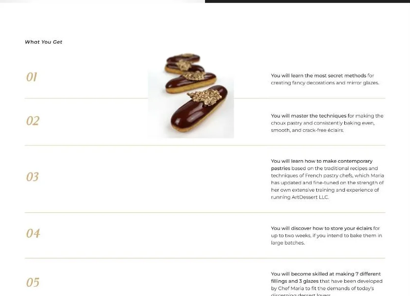
The “What You Get” block has seven numbered points with gold numerals and fine dividers: the secrets of decoration and mirror glazes, choux pastry and even, crack-free éclairs, contemporary desserts based on French techniques, keeping éclairs for up to two weeks, 7 fillings and 3 glazes, the theory behind every recipe and how the ingredients work together.
Then comes a gold strip with three course figures:
- 6/9 months – 24/7 access to the course, depending on the plan
- 50+ printable pages – recipes, techniques, tips and pastry chef’s notes
- 36 high-quality lessons with detailed instructions
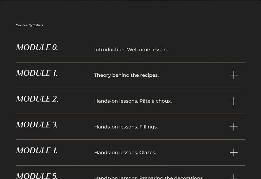
After a large macro shot of an éclair comes the “Course Syllabus” – the module-by-module programme on a dark background: an introductory lesson, the theory behind the recipes, then the practice – choux pastry, fillings, glazes and preparing the decoration. Modules expand when you click the “plus”, so the whole syllabus is visible without stretching the page.
Mobile version
On a phone, the header shrinks to a burger, the monogram and a “get started” link – the enrolment button sits right in the header. The first screen of the course page is rearranged into a column: the title, the éclair photo, the button and only then the text. The chequerboard blocks stack one below the other, keeping the alternation of dark and light, and the “play” button sits over the photo where the sections meet.
What makes a good online school website
You can’t taste an online course before you buy it. People decide based on the website: can they trust the author, will they manage it, and is the course worth the money? So when I build websites for online schools, I follow a few rules:
- the author’s face on the home page: in niche learning, people buy from a specific expert
- photos and video show the result, not adjectives
- the course page answers questions in order: who it is for, what’s inside, how many lessons and how long access lasts
- the syllabus is visible in full without being tiring – the modules are collapsed into an accordion
- one prominent enrolment button and a consistent style for every call to action
- a mobile version where the dessert photos look just as tempting as on a monitor
- lightweight images: a page full of large photos must load quickly on mobile data too
If you are launching online courses or a school and need a website that sells your teaching, I can build it from start to finish: from the page structure to the front-end build, interactive blocks and mobile version.
Project details
Project typenew website
CategoryBusiness website
TechnologiesHTML5, CSS3, JavaScript, responsive front end
Rolewebsite development: home page and course page build, mobile version, video block and syllabus accordion
ClientArt Dessert (Maria Tulchevska)
CountryUSA
What was done
- Built the home page: a first screen with the author and a choice of course, and chequerboard course blocks
- Put together the instructor blocks: quote, facts about the company and students, mission
- Created the “Contemporary Éclairs” course page with an “Enrollment is now open” first screen and a “get started” button
- Added an about-the-course block with video and four benefits
- Built “What You Get” – seven points with gold numbering
- Displayed the course figures: 6/9 months’ access, 50+ printable pages, 36 lessons
- Created a module-by-module syllabus in an accordion
- Built the mobile version: burger menu, “get started” in the header, single-column blocks
Result
- An online school website in English: home page and éclair course page
- A course page that answers buyers’ questions in order
- A consistent graphite-and-gold style across all pages
- A mobile version where the dessert photos and enrolment button stay in view