Nobody chooses dental implants in five minutes: patients spend weeks comparing clinics, prices and dentists. Using Mii Stomatoloh as an example, I explain how I built a single-service landing page – with the price on the first screen, an expert article, an implant catalogue, a before-and-after slider and a consultation form – and how it adapts to tablets and smartphones.
About the clinic and the brief
Mii Stomatoloh (Ukrainian for “My Dentist”) is a Ukrainian dental clinic offering treatment, surgery, diagnostics and implants. For implants using the MegaGen AO system, the clinic needed a dedicated page with a single scenario: visitors learn about the treatment, satisfy themselves that the clinic can be trusted, and leave their phone number.
Implants are an expensive treatment, and nobody decides on them on the spot. Patients compare prices, read up on implant systems, look closely at photos of previous cases and choose a dentist. So I started with the order of the blocks: what question comes up at each step, and where on the page the answer is. Then came the build, the interactive blocks and the responsive versions for computer, tablet and smartphone.
First screen and special offers
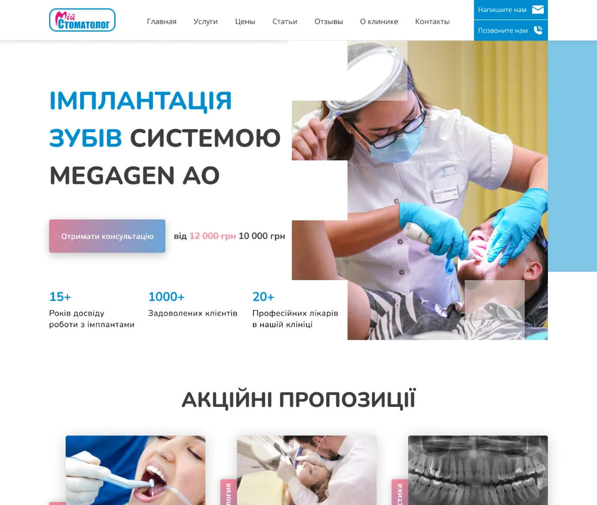
The first screen has everything patients come for: the large heading “Dental implants with the MegaGen AO system”, a “Get a consultation” button and the price. The old price of UAH 12,000 is crossed out, with the current UAH 10,000 next to it: visitors immediately get a sense of the cost and see the saving. Below are three figures for the clinic: 15+ years of placing implants, 1,000+ happy clients and 20+ dentists.
On the right is a photo of a dentist at work with a “crumbling” edge of squares and a light blue block behind it. The site’s main buttons have a pink-to-light-blue gradient in the colours of the logo: it is repeated across the page, so the eye quickly learns where to find the action. Besides the menu, the header holds two prominent buttons, “Write to us” and “Call us”.
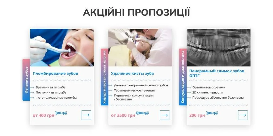
Right after the first screen come the “Special offers”: cards with a photo, a vertical colour tag for the treatment area – treatment, surgery, diagnostics – a list of what is included, the new price and the crossed-out old one.
An expert article patients can trust
A medical page is a special case for both patients and search engines: health advice is held to a stricter standard than a product description. So the expert article on the landing page shows who wrote it and when:
- the publication date – showing that the information is up to date
- the author and their position – the treating dentist, not an anonymous copywriter
- the reviewer – a second specialist who checked the text
- an “Important!” notice warning that the article does not replace a consultation with a doctor and is not intended for diagnosis
Next to the text is a collage of three photos: a dentist at work and close-ups of treatment. The block looks like part of the clinic rather than an extract from an encyclopedia.
Consultation form and implant catalogue
Straight after the article comes a bright blue banner, “Free consultation with our dentist”, with a photo of a dentist in the clinic’s branded polo shirt and a background pattern of dental icons. The form has a single field – phone number – and an arrow button: the less people have to fill in, the more willing they are to leave their details.
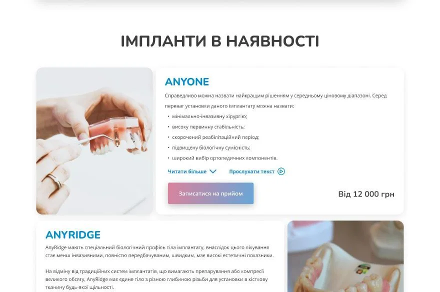
The “Implants in stock” block helps patients understand exactly what the clinic offers. The AnyOne and AnyRidge cards alternate their photo left and right and follow the same structure:
- the system’s name and a short description
- a list of benefits – minimally invasive surgery, high primary stability, a shorter recovery period
- a “Read more” link that expands the full text
- a “Listen to the text” button – the description can be listened to rather than read
- a “from UAH 12,000” price and a “Book an appointment” button
Before-and-after cases, dentists and price list
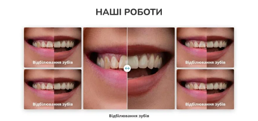
In dentistry the strongest proof is the result. In the “Our work” block, a large before-and-after image with a slider sits in the centre: move the handle to compare the smile before treatment with the result. Four thumbnails of other cases flank it, and there is a booking button below the gallery.
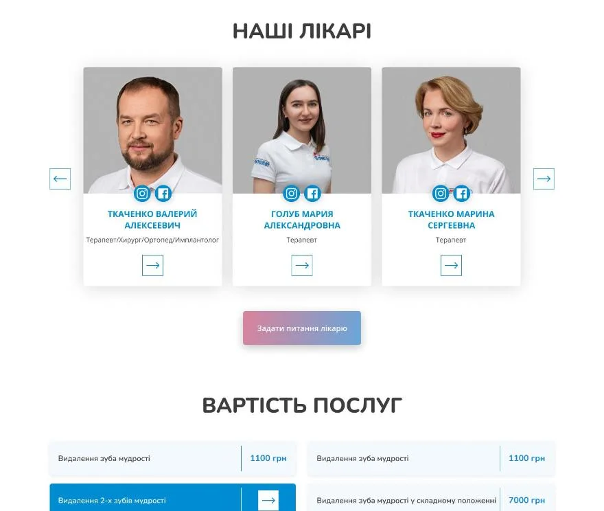
Next comes “Why choose us?”: four cards with photos covering experience with implants, high-quality prostheses, support during the adjustment period and complex clinical cases. The “Our dentists” block is a carousel with arrows: photo, name, specialism, Instagram and Facebook icons and a button linking to the dentist’s profile. Below the carousel is an “Ask the dentist a question” button.
The “Cost of services” price list is set out in two columns of “service – price” rows. The active row is highlighted in blue and an arrow replaces the price, making it clear that the row leads somewhere.
Questions about implants and additional services
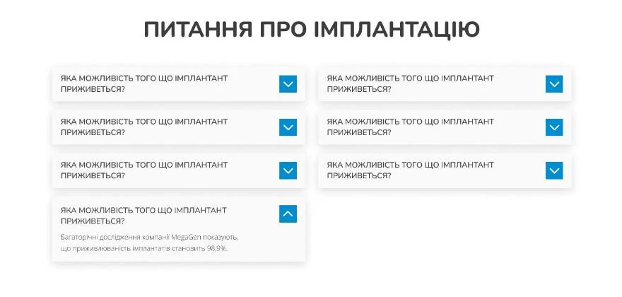
The “Questions about implants” block is a two-column accordion: the questions are visible at once, each answer opens with a click, and a long list does not stretch the page. This is where typical fears are addressed – for instance, whether the implant will take: the answer quotes MegaGen’s figure of a 98.9% survival rate.
The landing page closes with “Additional services” – the same cards with a treatment area tag as in the special offers: fillings, cyst removal, a panoramic X-ray. The repeated format holds the page together, and new services are added with the same card.
Responsive build for desktop, tablet and smartphone
The landing page is fully responsive: on a wide monitor, a tablet and a smartphone, each block rearranges itself to fit the screen rather than simply shrinking. On a smartphone the first screen runs in a different order: the heading, price and consultation button sit above the photo, the clinic’s figures stack in a column and the menu tucks into a burger icon. On the right of the header is a blue call button: on a phone, calling the clinic is easier than writing.
What makes a good dental clinic landing page
A clinic website sells trust rather than a service. People are trusting strangers with their health and a considerable sum of money, so every detail either reassures them or puts them off. When I build medical landing pages, I follow a few rules:
- the price is shown openly and early: a patient who cannot find the cost goes to look for it at a competitor’s
- real dentists’ faces and before-and-after cases are more convincing than general claims
- medical content is signed by a doctor and checked by a reviewer – this matters to patients and search engines alike
- booking takes one action: a call or a short form, with no registration or long questionnaires
- answers to common questions sit right on the page, in an accordion, so nobody has to look for them elsewhere
- the mobile version is reworked for the phone, not squeezed down from the desktop one: many patients look for a clinic on their smartphone
If you need a landing page for a dental clinic or a medical centre, I will build a page that leads patients to book: with a clear structure, forms, interactive blocks and a fully responsive build.
Project details
Project typelanding page
CategoryLanding page
TechnologiesHTML5, CSS3, JavaScript, responsive front end
Rolelanding page development: page build, responsive for desktop, tablet and smartphone, consultation form and interactive blocks
ClientMii Stomatoloh dental clinic
CountryUkraine
What was done
- Ordered the landing page’s blocks around patients’ questions – from price to booking
- Built the first screen with the special price, a consultation button and the clinic’s figures
- Created cards for special offers and additional services with a treatment area tag and the old price
- Set up the expert article with a date, a dentist as author, a reviewer and an “Important!” block
- Created a one-field free consultation form – phone number only
- Built the AnyOne and AnyRidge implant catalogue with expandable descriptions and a “Listen to the text” button
- Created a before-and-after slider with a case gallery, and a dentist carousel
- Built the “Why choose us?” block, a two-column price list and an FAQ accordion
- Built the responsive versions for desktop, tablet and smartphone
Result
- A one-page site on MegaGen AO implants with a free consultation form
- Trust-building blocks: an article with an author and reviewer, the dentists, before-and-after cases
- An implant catalogue and price list that answer the question of cost before the call
- A responsive build for desktop, tablet and smartphone