A dental clinic’s website works like the receptionist at the front desk: it greets visitors, answers their questions and books them in. Using a multi-page website for a dental clinic as an example, I explain which pages and features I built – from booking and the emergency line to specialist sliders and patient login.
About the project and the brief
The client is a general dental clinic: root canal treatment, cosmetic dentistry, implants, whitening, prevention and emergency care. The clinic needed a multi-page website in English that does three things: books appointments, helps patients who need urgent care and gives a detailed picture of the services and the team.
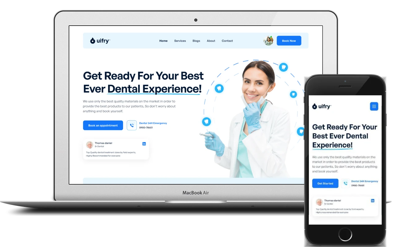
I built the site’s pages, put together the interactive blocks – forms, sliders, a video block – and made a responsive version for smartphones. Every page follows one consistent system: light blue sections, white cards with a soft shadow, blue buttons and key words in headings underlined with a wavy line.
Site structure
The site has seven pages, each with its own role:
- Home – booking, the emergency line, services, advantages, specialists, reviews and news
- Services – all the clinic’s treatments in cards
- Blogs – the clinic’s news and articles
- About – the clinic’s story
- Contact – contact details
- Login and Sign up – patient login and registration
The header menu is the same on every page. On the home and services pages, the right-hand side holds a “Book Now” button and a user avatar; on the login page, “Login” and “Sign up” links take their place.
Home page: appointment booking and the emergency line
The first screen opens with the heading “Get Ready For Your Best Ever Dental Experience!” and a short promise about the quality of materials. Below it are two actions: a blue “Book an appointment” button and a button with a phone handset and the “Dental 24H Emergency” number. Patients planning a visit book an appointment, while anyone in pain right now sees at once where to call.
Below is a card with a specialist’s testimonial and a LinkedIn icon, and on the right a photo of a smiling dentist framed by dotted orbits with tooth icons. Straight after the first screen come three cards for the main services: root canal treatment, cosmetic dentistry and implants. Each has an icon, a short explanation and a “Learn More” link.
New patients, advantages and video
The “We’re Welcoming New Patients” block speaks to people who have not been to the clinic yet. It has a form with a single field – phone number – and a “Submit” button: visitors can leave their number right on the home page, without going to the contact page.
Next comes the “Why Choose…” block, with a photo of a specialist at work and a short list of reasons to choose the clinic:
- a strong team of dentists
- modern dental services
- discounts on treatment
- quick and easy booking
Below the list is another “Book an appointment” button. The same button appears in the “Leave Your Worries At The Door…” block with a large photo of a smile, so booking is always within sight. This part ends with a video block – a wide shot of a treatment room with a play button and a “Watch Playlist” button.
Specialists, reviews and news
The “Meet Our Specialists” block is a team slider: a photo of each dentist, their name and specialism on a semi-transparent panel, and a LinkedIn icon in the corner of the card. The team includes an orthodontist, an endodontist, a periodontist and a paediatric dentist, and arrows below the slider scroll through the cards.
“Our Happy Clients” is a second slider, with patient reviews: an avatar, a name, a five-star rating and the review text. The “News & Articles” block shows the latest posts and a “View All” button that leads to the blog.
Services page
The Services page brings all the clinic’s treatments together in a grid of six cards:
- Root Canal Treatment
- Cosmetic Dentist
- Dental Implants
- Teeth Whitening
- Emergency Dentistry – urgent help when bleeding needs to be stopped or severe pain relieved
- Prevention – preventive care and oral hygiene
The cards work the same way as on the home page: an icon in a light blue circle, a heading, a couple of lines of description and “Learn More”. Patients quickly find what they need, and new services are added with the same card.
Patient login and sign-up
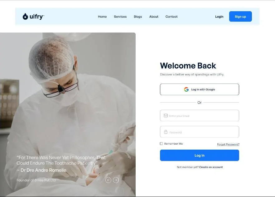
The login page is split into two halves. On the left, a photo of a dentist at work and a quote, with arrows to switch between quotes. On the right, the “Welcome Back” form:
- a “Log in with Google” button – sign in with a Google account
- email and password fields with icons
- a “Remember Me” checkbox and a password reset link
- a “Log in” button and a “Create an account” link for anyone who does not have an account yet
Registration has its own Sign up page, reached from the header button and from the link below the login form.
Mobile version
On a smartphone the pages reflow into a single column. The header shrinks to the logo and a square menu button. On the first screen the heading and text come first, then the “Get Started” button and the emergency number side by side, with the testimonial card and the dentist’s photo below. Patients see what matters most – booking and the phone number – straight away, without scrolling.
What makes a good dental clinic website
People come to a dental clinic’s website in one of two frames of mind: they are planning treatment and comparing clinics – or they have toothache and need to see a dentist today. A good clinic website serves both. When I build websites for medical centres, I follow a few rules:
- booking goes on the first screen and comes up again further down the page
- the emergency number stands apart and is easy to spot: someone in acute pain has no time to hunt for contact details
- services are presented as short cards with clear names and a link to the details
- doctors’ faces and patient reviews build more trust than general claims about quality
- a blog with news and articles answers common questions and helps the site rank in search
- the mobile version is not a scaled-down copy: on a phone, buttons are large and the number is always to hand
If your clinic needs a website that brings in patient bookings, I can build it from start to finish: pages, booking forms, sliders, patient login and a responsive front end.
Project details
Project typenew website
CategoryBusiness website
TechnologiesHTML5, CSS3, JavaScript, responsive front end
Rolewebsite development: page build, responsive front end, booking and login forms, sliders and video block
Clientdental clinic
What was done
- Built a multi-page website: Home, Services, Blogs, About, Contact, Login and Sign up
- Built the first screen with appointment booking and a 24/7 emergency line button
- Created service cards on the home page and a services page covering six treatments
- Added a new patient form with a phone number field
- Built the clinic’s advantages block and a video block with a “Watch Playlist” button
- Created specialist and patient review sliders with arrows
- Added a “News & Articles” block linking to the blog
- Built login and sign-up: email, password, “Remember Me”, password reset, Google button
- Built the responsive smartphone version
Result
- A multi-page clinic website in English with a consistent style across all pages
- Appointment booking and the emergency number on the first screen
- Services, specialists, reviews and news that answer patients’ questions before they call
- Patient login and sign-up on the site
- A responsive smartphone version