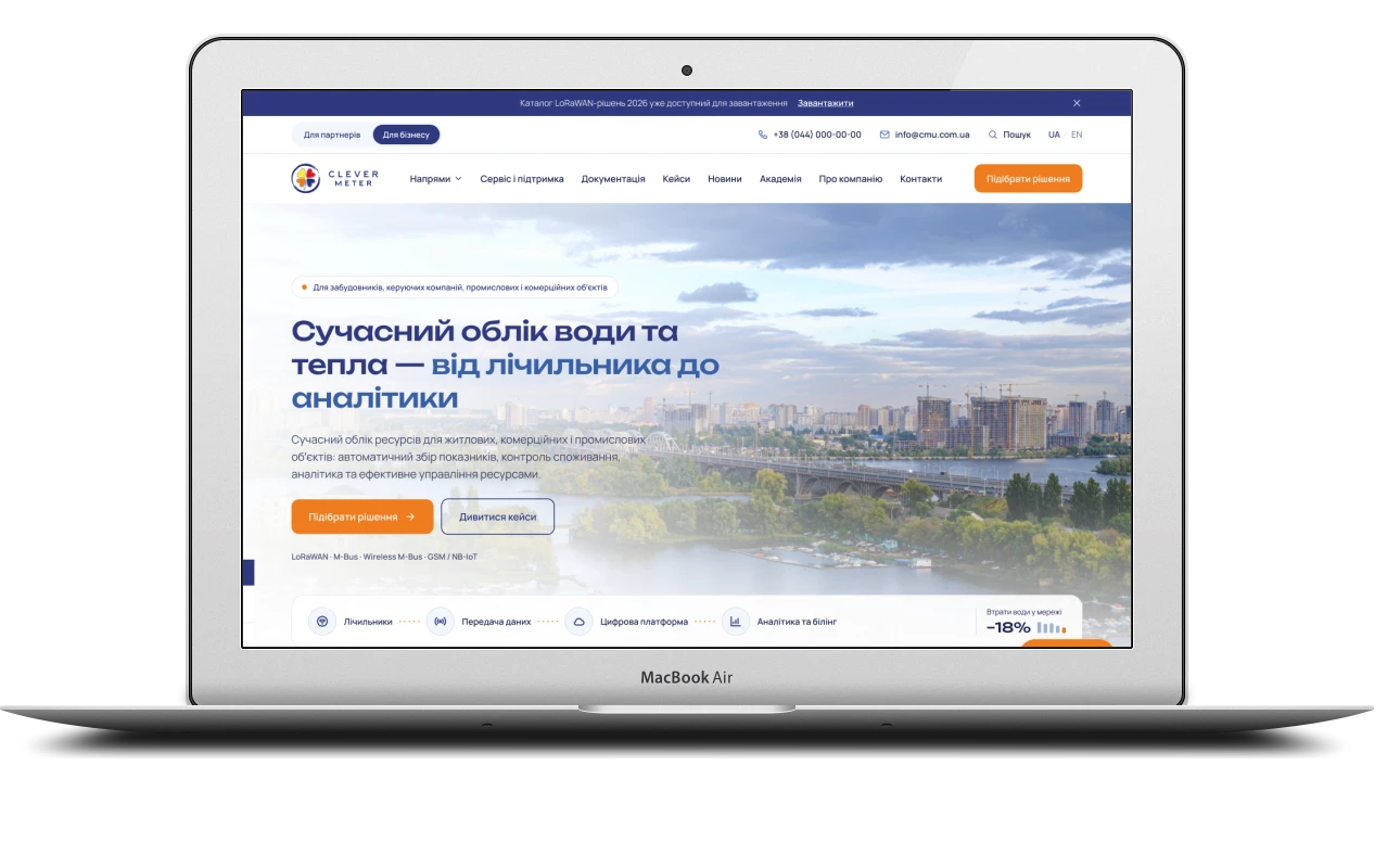
A company that sells complete metering systems rather than devices needs a website that builds trust, explains and brings in enquiries – all at once. Using Clever Meter Ukraine as an example, here is how a 65-page brief became first a design and then a large bilingual WordPress website with audience segments, geolocation, documentation, case studies, forms and an in-house mailing list.
The client and the brief
Clever Meter Ukraine works in water and heat metering: it selects and supplies meters, sets up automatic meter reading, and offers software, analytics, billing integration and service. The company works with the manufacturers Apator Powogaz, GWF and ADD Grup. It needed a corporate website that shows the key point from the very first screen: the company builds the whole metering system, not just sells devices.
The client handed over a detailed 65-page brief – a sitemap, the blocks of every page, two audiences, and requirements for forms, accessibility, security and admin roles. I ran the whole project: design, development, content set-up and final checks before handover.
Design: from brand book to UI kit
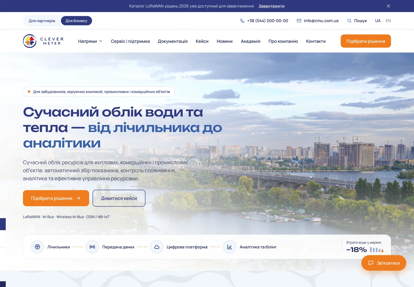
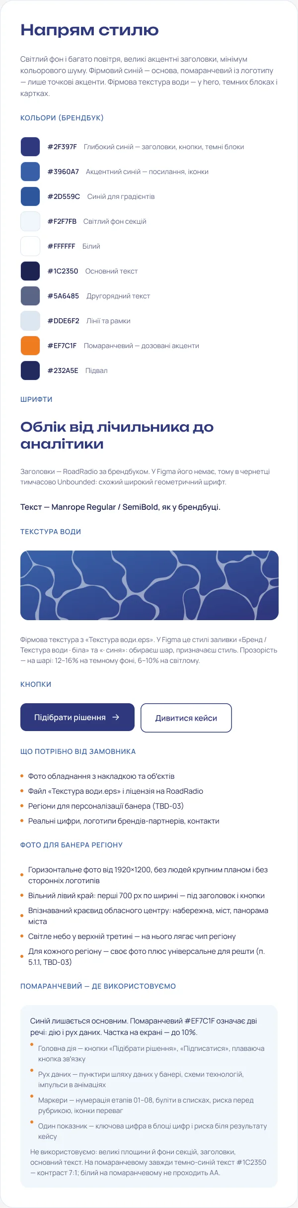
I built the style on the brand book and the signature water texture: the brand’s navy and light blue, the corporate typefaces, white and pale blue sections. I converted the texture from the client’s source file into a vector mask, so on the website it is light and changes colour to suit the background. The brand orange appears only where there is an action or data in motion: main buttons, dotted data paths, step numbers, key figures.
Besides the home page, the design includes around twenty inner page templates and a separate UI kit:
- colour tokens, typography, a 12-column grid and a spacing scale;
- buttons and form fields in every state – default, hover, focus, error, disabled;
- cards, badges, tables, messages, loading skeletons and empty states;
- a form pop-up in four states – filling in, error, sending, success with a request number;
- an animation sheet: what moves, for how many milliseconds and why – no decorative motion.
Two audiences: “Partners” and “Business”
The website has two audiences with different questions. A water utility or a local community cares about network scale and loss control; a developer or a property management company cares about per-flat metering and payback. So the website runs in two versions with a shared structure: the switch in the header and the mobile menu leads to the same page in the other version, and the “Business” version has its own address prefix – handy for ads and mailings.
Each version shifts the emphasis: banner headings and texts, calls to action at the bottom of pages, the set of solution areas on the home page, telemetry scenarios. Case studies and news for the current segment move to the top of the lists, the rest follow – nothing is hidden. For search engines both versions point to one address, so there are no duplicates in the index, while the cache stores them separately.
Home page: the visitor’s region on the first screen
The first screen is a full-width city photo, the brand texture and the headline “from meter to analytics”, with a glass data-path strip at the bottom: meters → data transmission → digital platform → analytics and billing. The photo depends on the visitor’s region: it is detected on the server from the IP address using a local database that updates once a month. The browser asks nothing, the IP is never stored, and visitors whose region cannot be detected see a universal photo.
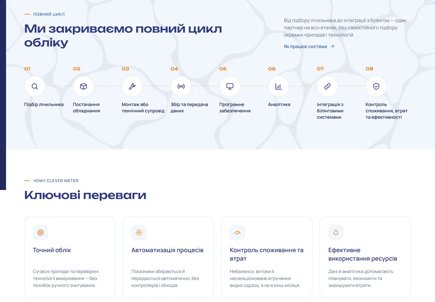
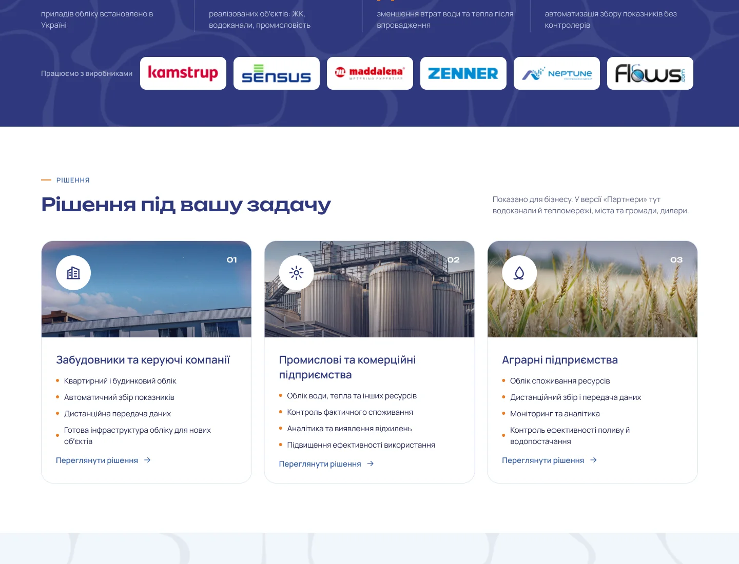
In the admin panel, each region gets its own photo and, if needed, its own IP ranges, and an editor can preview the home page as it looks in any region. Further down: the full eight-step metering cycle, key advantages, company figures and manufacturer brands, solutions, data transmission technologies, case studies, industry news and a “we’ll find the right solution” block.
Product sections: from metering to service
Each section answers its own visitor question and ends with a clear next step:
- Resource metering – types of metering and a calculator: visitors enter the number of meters, how often readings are taken, minutes per meter, the hourly cost of a meter reader and the share of repeat visits, and instantly see the annual savings and the hours freed up by remote reading;
- Solutions – areas for water utilities, communities, dealers, developers, industry and agriculture, each with its own page: the site’s pain points, what the package includes, equipment, related case studies and documents;
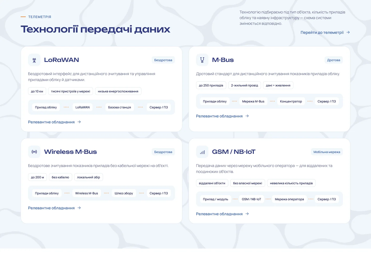
- Telemetry – the data path from device to billing, the LoRaWAN, M-Bus, Wireless M-Bus and GSM/NB-IoT technologies, and an interactive diagram: choose a type of site and the diagram rebuilds itself;
- Software – meter data collection, loss and imbalance control, reports, billing integration and booking a demo;
- Service and support – exchange, repair and calibration, a request form with device selection and upload of up to five photos;
- About us – the company history with a map of its expanding reach, a video in a pop-up player, partner manufacturers and a form for future dealers.
Technical documentation and case studies on a map
Documentation is a separate library for engineers and designers. Documents can be searched by title, model and part number and filtered by type (manuals, catalogues, certificates, wiring diagrams, BIM/CAD), equipment category, technology, manufacturer and language. Each document shows its format, size, version and update date, outdated versions are flagged, and some files are released after a short form – so the company gets the designer’s contact details.
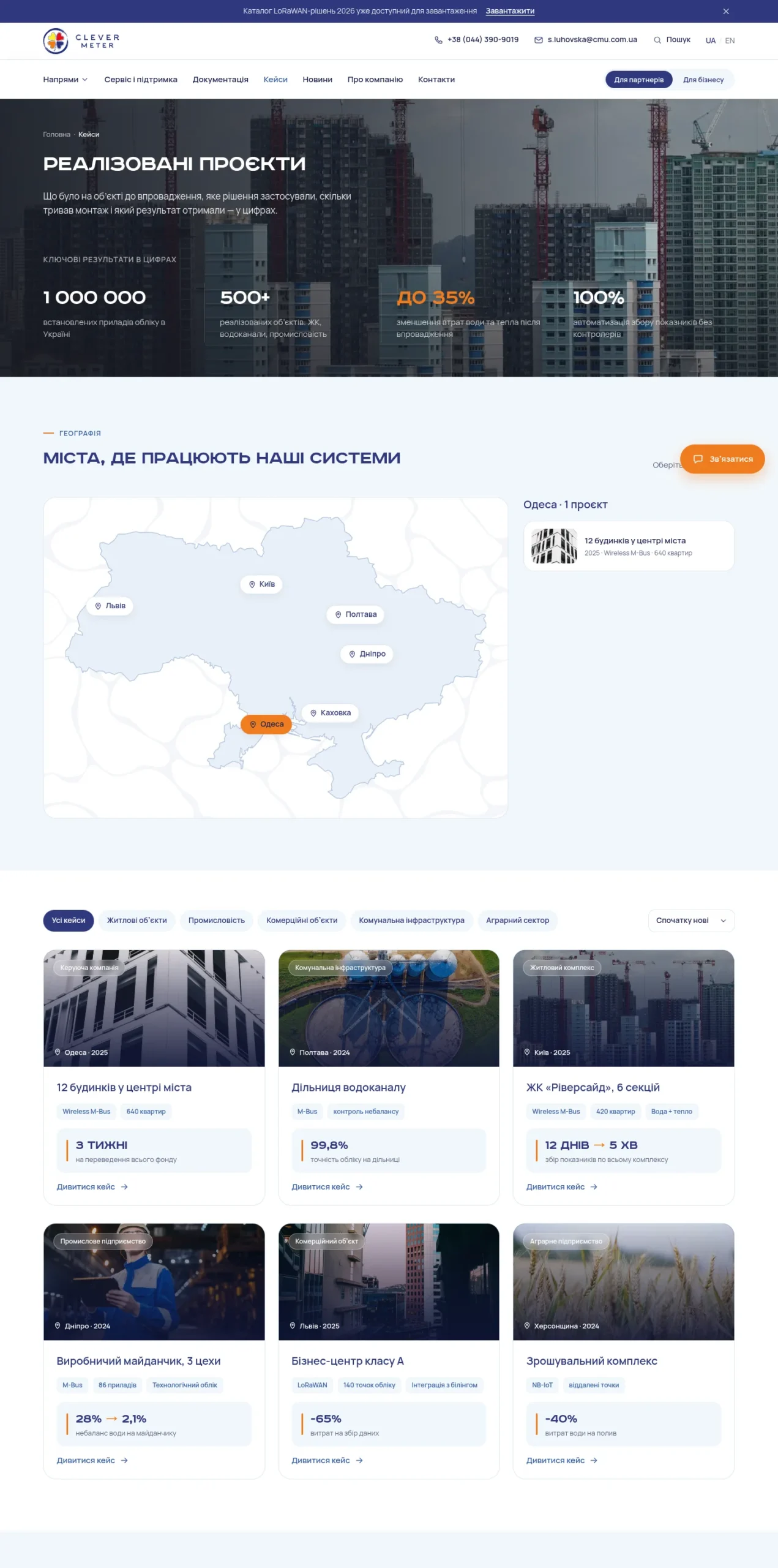
Case studies are shown on a map of Ukraine: pick a city and see the projects there; on a phone, a tidy list of cities replaces the map. The directory holds all 460 cities of the country in Ukrainian and English, so a new case study can be linked to any city by picking it from a list. Each case study page reads like a story: the site, the problem before the project, how the system is built, the equipment used, the outcome and a button to get a quote for a similar site.
News, search and the mailing list
The news section uses the WordPress block editor with my own blocks – expert opinion with a directory of experts, a highlighted fact, a call to action, related materials. Each article has a reading time, a table of contents, tags, share buttons and related posts; photos and galleries can be downloaded one by one or as an archive. An article cannot be published without a title, summary, cover image and image description.
Search understands different word forms and looks both in page texts and in document and case study fields; suggestions drop down as you type and work with the keyboard. For subscriptions I wrote an in-house mailing system with no external services: address confirmation, choice of categories and topics, an email as soon as a new article is out or a weekly digest, a block-based email builder, a sending queue with limits, one-click unsubscribe and subscription management, and subscriber export.
Enquiry forms: request number, departments and spam protection
Each language has 11 forms – find a solution, consultation, calibration, repair, partnership, cost and payback estimate, document request, subscription and a general form on the Contacts page. Forms open in pop-ups that keep focus inside and close with Esc, and on a phone they slide up from the bottom. Every enquiry gets a number in the CMU-year-number format – it arrives in the email and is shown on the success screen.
- on the Contacts page the visitor chooses a topic – and the message goes to the right department, whose addresses are set in the admin panel;
- an enquiry can include a specification, a site plan or a photo of the metering unit;
- spam protection uses an invisible honeypot field, a fill-in time check and a limit on submissions from one device – no captcha for real people;
- all enquiries are stored in the admin panel, and the “Client contacts” section groups them by person – by email or phone – with search and Excel export.
English version with Polylang
The main language of the website is Ukrainian, and the English version is fully translated: pages, news, case studies, documents, categories, menus, forms, mailing emails and every interface label. Both versions share the same addresses apart from the language prefix; the UA / EN switch leads to the same page and, if there is no translation, says so instead of opening an empty page. Global settings and site blocks have their own values for each language, and an empty field falls back to the Ukrainian text.
Everything is edited from the admin panel
The client’s main requirement was no texts, figures or photos in the code. Every block of the design became an ACF field – on the page it belongs to, or in the shared “Site settings” and “Site blocks” sections: contacts, departments, social networks, the quick contact button, company figures, brands, form pop-up texts, calls to action. Texts are written in a visual editor, yet the look stays true to the design: paragraphs and lists pick up the design styling automatically. Fields carry hints about where they appear on the website.
Roles are set up for the team: a content manager runs news, the media library and enquiries but cannot touch pages, documents or settings. The media library strips location data from photos, creates smaller WebP copies and shows where each image is used. Videos can be added as a YouTube link or as a file.
SEO, speed and security
The website is ready for SEO from day one: readable addresses with redirects from the old ones, breadcrumbs with structured data, SEO titles and descriptions in Yoast, and language tags for search engines. Fonts are hosted locally, images are served at the right size and load as you scroll, inner pages are cached, while the home page with its regional banner is not.
Security follows the brief: browser security headers, protection against password guessing, strong passwords, optional two-factor login, closed service interfaces and an activity log in the admin panel. Before handover I went through the whole website in both languages and both versions: no page errors, every form tested, no horizontal scrolling on a phone.
Why a technology company needs a well-thought-out website
When a company sells complex engineering solutions, its website acts as the first consultant. An engineer at a water utility, a local community representative or a developer must quickly understand what is on offer and how it works. That is why my B2B websites follow a few principles:
- complex things are explained through diagrams, steps and calculators, not paragraphs of jargon;
- different audiences get different emphasis within a shared structure;
- every page has a clear next step: find a solution, book a consultation, get a document;
- documentation and case studies prove expertise and are easy to search;
- all content is in the team’s hands, in every language, without a developer.
If you need a full-cycle corporate website – from design based on a brief to the development of complex features – I will take the project from the first mock-up to the handover of a finished website.
Project details
Project typecorporate website design and development
CategoryBusiness website
TechnologiesFigma, UI kit, WordPress, custom theme, PHP, JavaScript, HTML5, CSS3, ACF, Polylang, Contact Form 7, Flamingo, Yoast SEO, Relevanssi, LiteSpeed Cache, in-house mailing system
Roleend-to-end project from the brief: design, UI kit, custom WordPress theme, features, ACF fields, English version, testing
ClientClever Meter Ukraine
CountryUkraine
What was done
- Designed the home page, around twenty page templates, a UI kit and an animation sheet based on the brand book
- Developed a WordPress theme where all content – texts, figures, photos, contacts – is edited in ACF fields
- Built two versions of the website – “Partners” and “Business” – with their own addresses, texts and order of case studies and news
- Set up the first-screen photo by the visitor’s region using an in-house IP database
- Built the resource metering section with a calculator, solutions, telemetry with an interactive diagram, software, service, about us and contacts
- Built a documentation library with search, filters and file release after a form
- Created case studies on a map of Ukraine, news with custom editor blocks, and search with suggestions
- Set up 11 forms per language with a request number, routing by department, spam protection and a contact book
- Wrote an in-house mailing system: confirmation, categories, weekly digest, email builder
- Translated the website into English with Polylang, set up SEO, caching, security and roles
Result
- A large bilingual corporate website with separate messaging for partners and for businesses
- Documentation library, case map, news and mailing list – with no external services
- Enquiries with a request number that go straight to the right department
- The client’s team runs all content in two languages from the admin panel
- The website was tested across all pages, languages and versions and is ready for handover