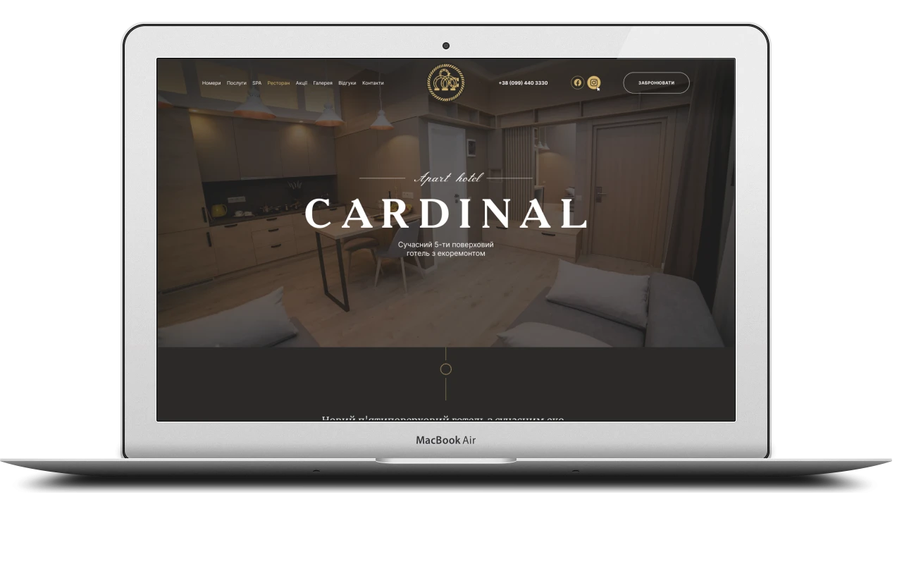
A hotel website is the guest’s first tour of the place: they need to see the room, get a feel for the atmosphere and understand straight away how to book. Using the Cardinal aparthotel as an example, I explain how I built a website with rooms, a spa complex, a restaurant, a gallery and booking forms in pop-up windows.
About the hotel and the brief
Cardinal is a new five-storey aparthotel with eco-friendly interiors in Truskavets, a three-minute walk from the central pump room and close to a park. The rooms have kitchens and work as self-contained apartments, backed by full hotel facilities: a spa complex, a restaurant with a bar, a beauty salon, a conference room, transfers and meals delivered to the room.
The hotel needed a website where guests can take a good look at a room, find out about the spa and the restaurant, and send a booking request straight away. I built that website: ten pages, sliders and tabs, a gallery with lightbox viewing and booking forms in pop-up windows.
Site structure
Everything the hotel offers is spread across the pages so that guests find what they need in one or two clicks:
- home page – a showcase of everything the hotel offers
- rooms – six categories with photos, amenities and a booking form
- spa – the seven areas of the complex and a separate Finnish sauna page
- restaurant – opening hours, table booking by phone, dress code and a PDF menu
- a gallery with a section filter and photos that open in a pop-up window
- reviews, special offers, contacts with a map and the privacy policy
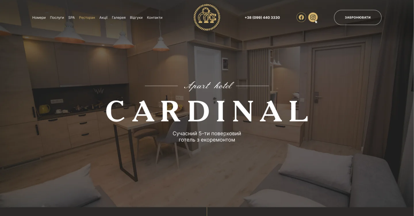
The header is the same on every page: the section menu on the left, the logo in the centre, and the phone number, Facebook, Instagram and a “Book” button on the right. Inner pages open with a heading and breadcrumbs, and the footer repeats the address, phone numbers, social links, the booking button and links to the privacy policy, house rules and blog. Wherever guests are on the site, a call or a booking request is one click away.
Home page: the hotel’s shop window
The first screen is a full-width photo of a room, the caption Apart hotel, the name CARDINAL in large letters and a short description: a modern five-storey hotel with eco-friendly interiors. Below it, a paragraph covers the hotel’s main advantage – its location next to the central pump room and the park.
The home page then sets out the reasons to choose the hotel, one by one:
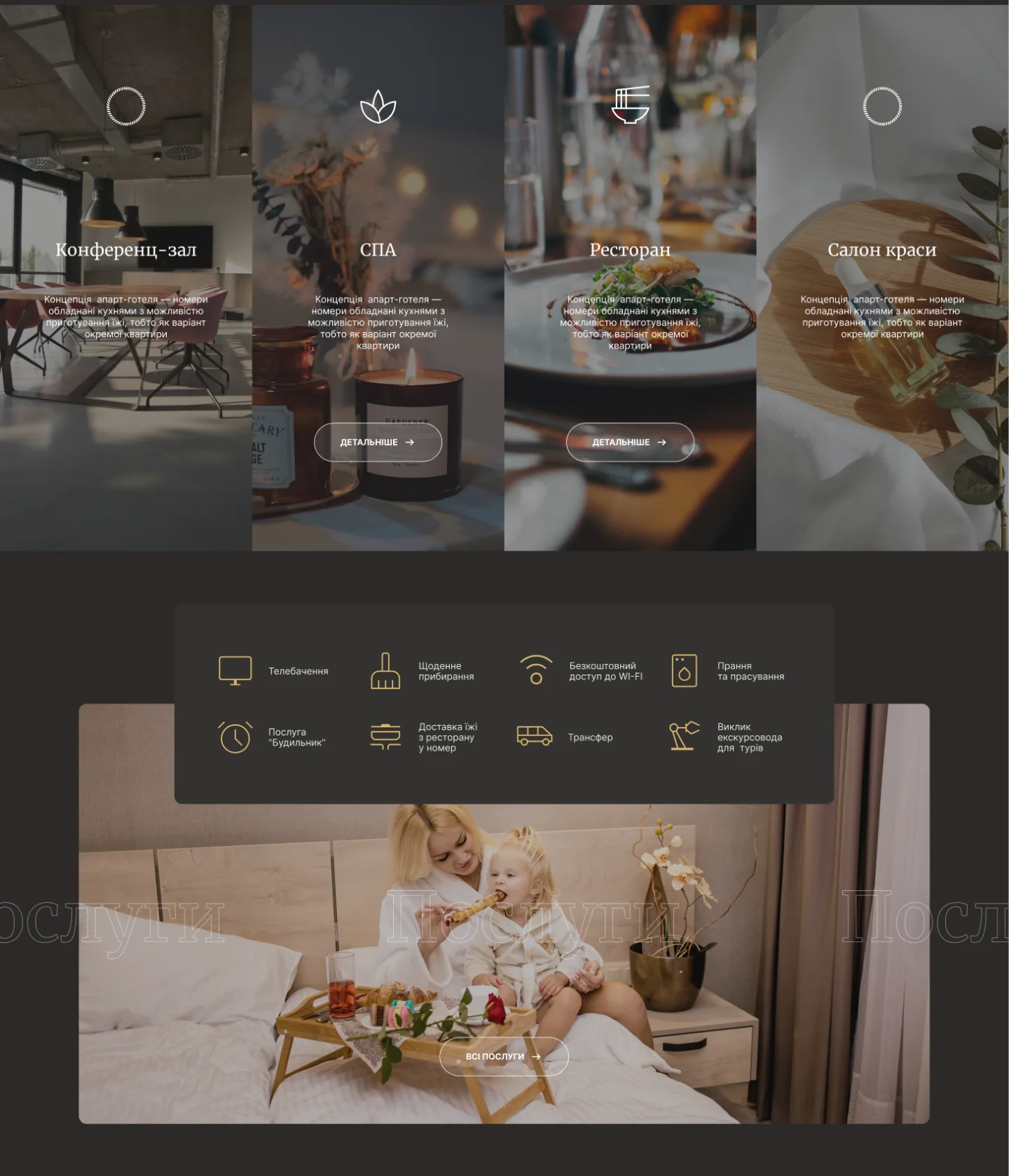
- a room slider with arrows and a card with a “Details” button
- “Location and leisure” and “View from the rooms” blocks, with a photo of a balcony overlooking the town
- four vertical tiles – conference room, spa, restaurant and beauty salon: on hover, a tile lights up and reveals a button to its page
- eight services with icons: daily housekeeping, Wi-Fi, TV, wake-up calls, transfers, a tour guide, laundry and ironing, and meals from the restaurant delivered to the room
Rooms: tabs, sliders and booking
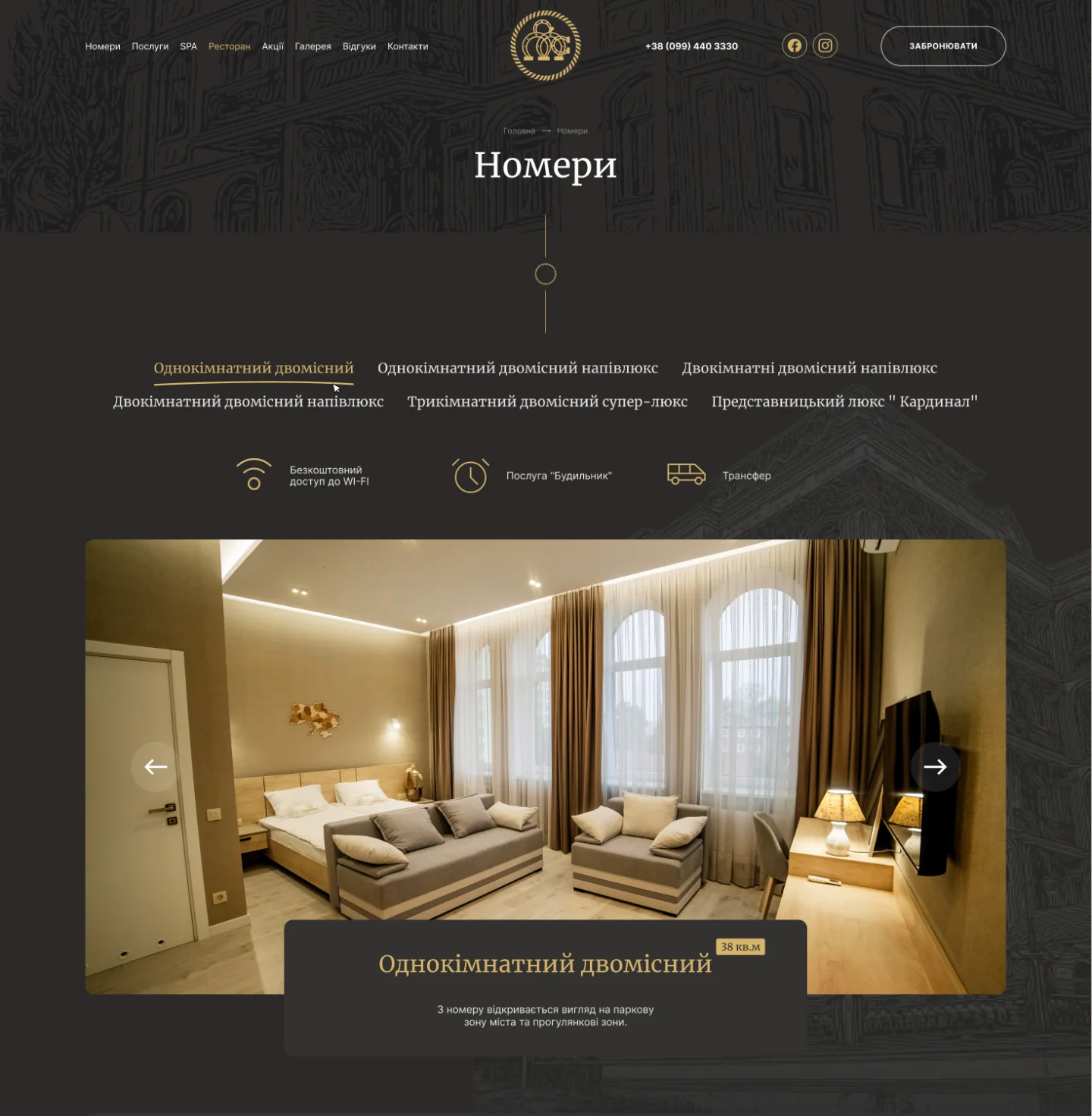
The rooms page is the one that sells. Six categories – from a one-room double to a three-room superior suite and the “Cardinal” executive suite – switch with tabs, without reloading the page. Each category has its own photo slider, a name, a badge with the floor area (38 m², for example) and a few words about the view.
The “Every room is equipped with” block gathers into a grid of icons what guests usually ask about on the phone: a kitchenette, a fridge-freezer, crockery, a kettle and tea set, a shower, 180×200 beds, toiletries, Wi-Fi and a welcome gift. Extra services – laundry, room service, excursions, flower delivery, a beautician, a make-up artist, massage – are listed in large type, and hovering over a service brings up its photo alongside.
At the bottom of the page is the “Book a room” form: check-in and check-out dates picked from a calendar, number of guests, name, phone, email and a comment, with required fields marked by an asterisk. The same form opens in a pop-up window from any “Book” button, so a request can be sent from any page without losing what the guest is looking at.
The spa complex and the Finnish sauna
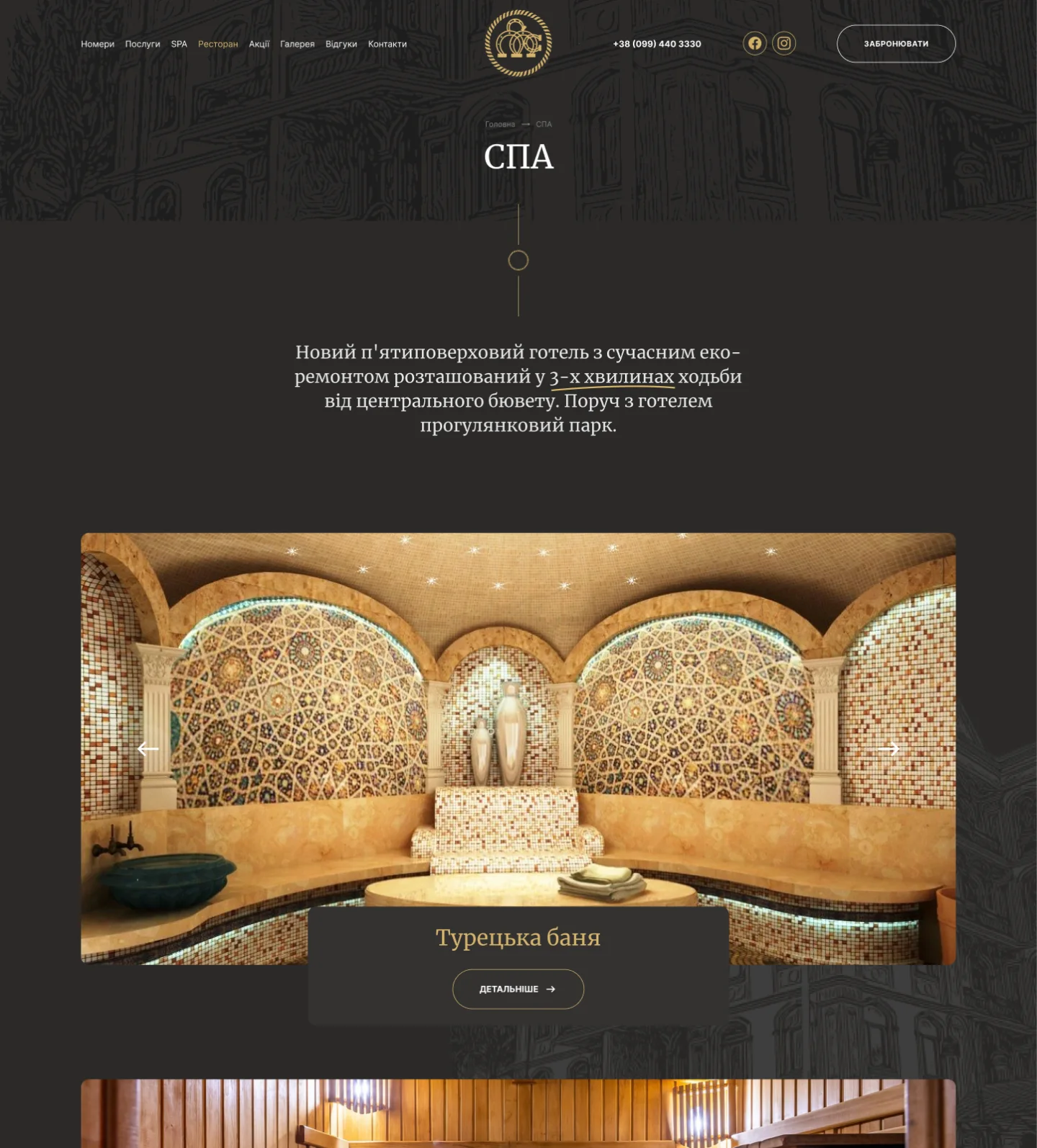
The spa is one of the hotel’s strengths, so it has its own page: a Turkish bath, a Finnish sauna, a jacuzzi, an outdoor jacuzzi, a herbal tea bar, a gym and beauty treatments. Each area gets a large slider with a caption and a “Details” button.
The Finnish sauna has a page of its own, which shows how an area is presented. Its specs are set out as icons – temperature 80–100 °C, humidity 10–20%, up to 8 people, natural wood, benches on two levels, drinks from the herbal tea bar – next to a short piece on the benefits of the sauna and a “Reserve online” form with name, phone and email.
The room booking and spa reservation forms check what is entered: if a value is wrong, the field is highlighted with an error message, so guests see straight away what to correct.
Restaurant, gallery, reviews, offers and contacts
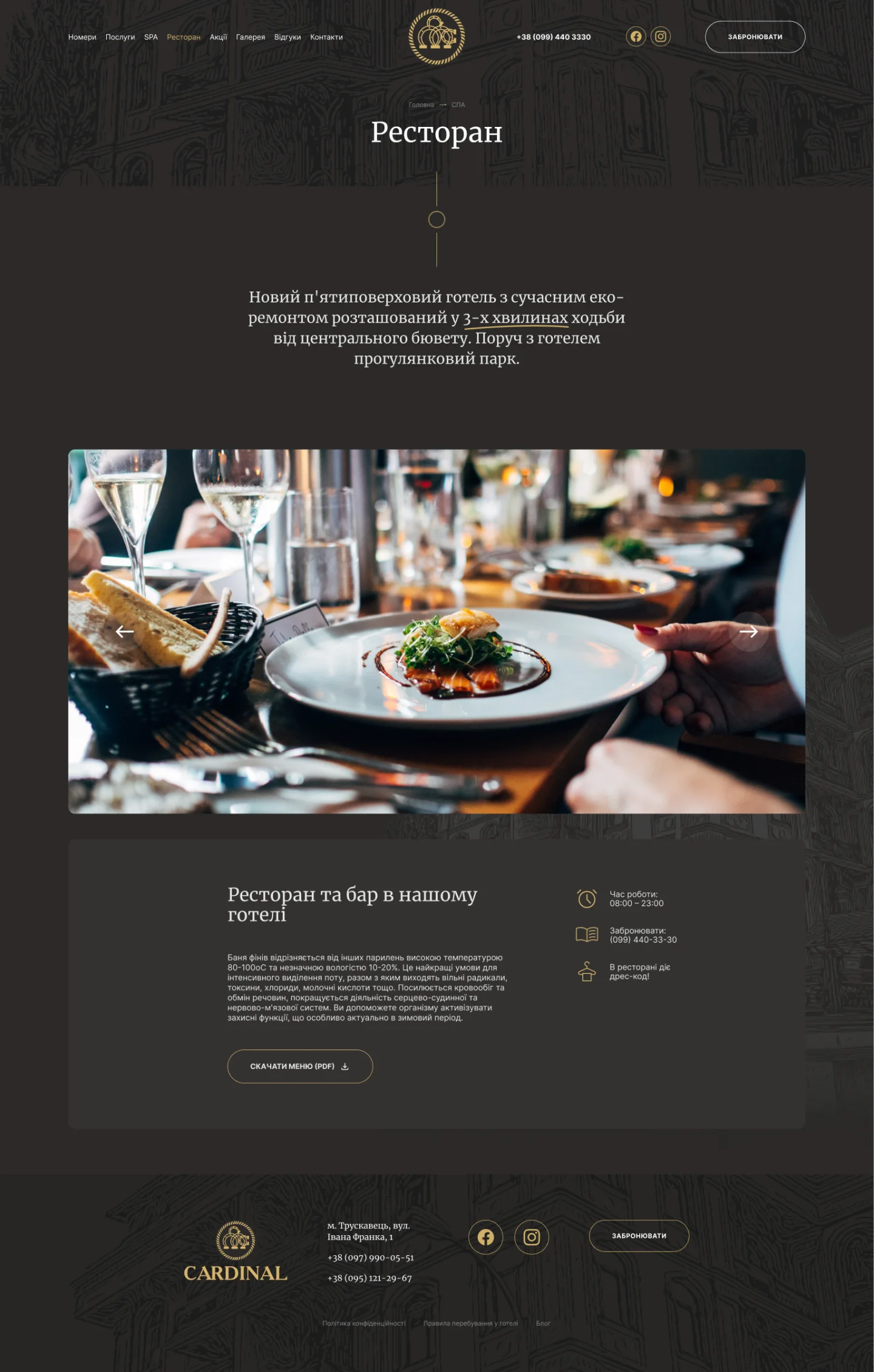
- Restaurant – a page with photos and answers to practical questions: opening hours 08:00–23:00, a phone number for table bookings, the dress code, drinks from the herbal tea bar and a “Download menu (PDF)” button.
- Gallery – the “Hotel grounds”, “Spa”, “Restaurant” and “Leisure” tabs switch between sets of photos without reloading, and a click opens a photo in a pop-up window with arrows to browse through.
- Reviews – cards with the guest’s name, town, date and star rating, with pagination.
- Special offers – cards for deals, for example on spa treatments and transfers to the hotel.
- Contacts – a photo of the façade, the address, phone numbers, email, social links, a “Contact us” button and a full-width map.
- Privacy policy – a separate page explaining how the hotel collects and uses the details guests leave in the forms.
Look and front-end build
The site uses a dark graphite palette with gold accents: gold picks out the buttons, active tabs, icons and section names. Headings are set in a classic serif, body text in a calm sans-serif, and a fine line drawing of the hotel’s façade serves as the background for inner page headers, the footer and some blocks.
When building the pages, the challenge was to keep this character without losing usability: warm interior photos had to stand out on the dark background, the background artwork could not get in the way of the text, and the tabs, sliders, pop-ups and forms had to behave the same on every page. That is why the repeating elements – the header, the card with a slider, the icon grid, the booking form – are built as shared blocks and reused across the site.
What makes a good hotel website
Guests choose a hotel with their eyes: photos of the room, the view, the spa and the restaurant count for more than long descriptions. A hotel’s own website is where it can show itself in full and take bookings directly. When I build a website for a hotel, I follow a few principles:
- real photos instead of stock images – guests should recognise the room when they arrive
- room categories with floor area and amenities, so they can be compared without a phone call
- a booking button and phone number on every page, and a short request form
- facilities – spa, restaurant, services – presented as part of the offer, not a line in small print
- reviews, special offers and a map to settle any last doubts
- a privacy policy, since the site collects names, phone numbers and email addresses
If you need a website for a hotel, guest house or spa complex, I can build the whole thing for you – from the page structure to sliders, a gallery and booking forms.
Project details
Project typenew website
CategoryBusiness website
TechnologiesHTML5, CSS3, JavaScript
Rolewebsite development: page build, tabs and sliders, lightbox gallery, booking forms in pop-up windows
ClientCardinal aparthotel
CountryUkraine
What was done
- Built 10 pages: home, rooms, spa, sauna, restaurant, gallery, reviews, special offers, contacts and privacy policy
- Created a shared header with the menu, phone number, social links and a “Book” button
- Built the home page with a room slider, hover-effect tiles for each part of the hotel and a services block
- Built the rooms page: six categories in tabs, photo sliders, amenities, extra services with photos on hover
- Created room booking and spa reservation forms in pop-up windows, with field validation
- Built the spa page covering seven areas with sliders, and a separate Finnish sauna page
- Built the restaurant page with opening hours, dress code and a downloadable PDF menu
- Created a gallery with a section filter and photos opening in a pop-up window
- Built the reviews with ratings and pagination, the special offers, and contacts with a map
Result
- A 10-page hotel website with booking pop-ups
- Choosing a room and sending a booking request on a single page
- Separate pages for the spa complex, the Finnish sauna and the restaurant
- A gallery, reviews, special offers and contacts that answer guests’ questions before they call