A landscaping company’s website sells above all through images: lush gardens, green roofs and lit paths are more convincing than any list of services. Using TOPIAR as an example, I explain how I built a corporate website with an animated home page, services that open on hover, a portfolio filtered by type of project and enquiry forms.
The company and the brief
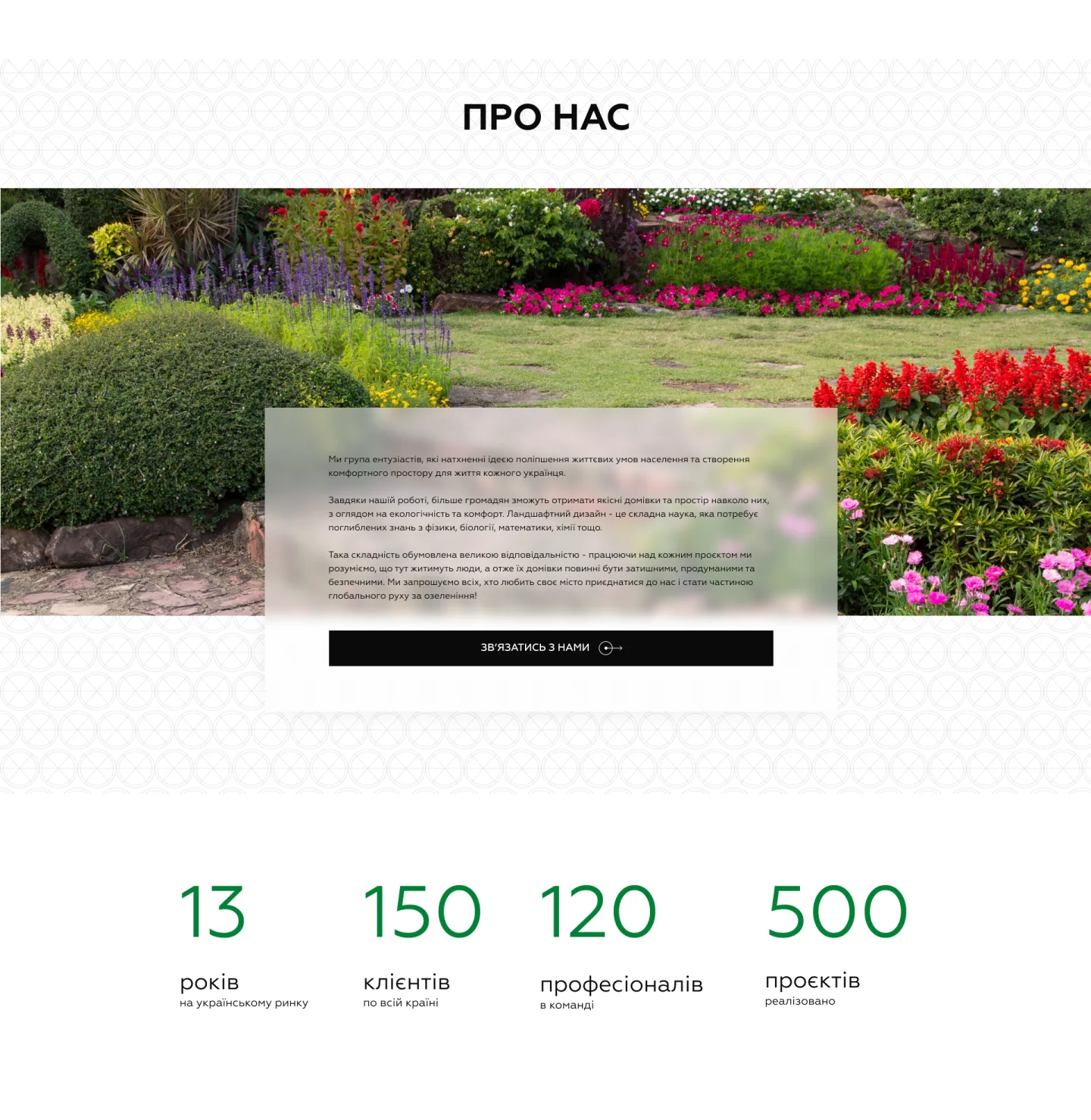
TOPIAR is a landscaping company based in Kyiv. It plans gardens and grounds, supplies and plants trees and shrubs, creates green roofs and installs landscape lighting. On its website, the company appears together with the non-profit organisation “Happy Country”, which promotes a simple idea: the environment around your home affects your health, mood and quality of life, and a well-planned garden is not a luxury but a normal part of a good life. The company sums itself up in figures: 13 years on the Ukrainian market, 150 clients across the country, 120 specialists on the team and 500 completed projects.
People choose landscaping with their eyes. Before they call, they want to see the gardens, terraces and roofs the company has already created, understand what it does and who works there. So the website had to show the work at full size, explain the four areas of work in a few words, build trust through the team and reviews, and lead visitors from any page to a free consultation request. The website is in Ukrainian.
First screen and mission
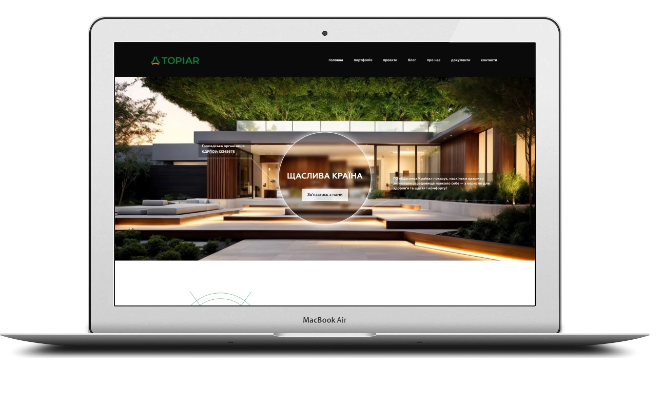
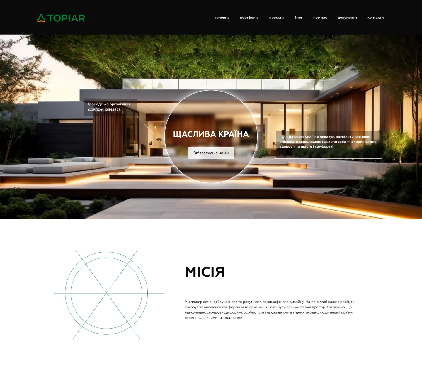
The header is a dark bar with the TOPIAR logo and a menu: “Home”, “Portfolio”, “Projects”, “Blog”, “About us”, “Documents” and “Contacts”. Below it is a photo of a modern house with a terrace and lighting, and in the centre of the frame sits a round “lens” with the organisation’s name and a “Get in touch” button. On either side are two captions with thin leader lines: the type of organisation and its core message about why it matters to change the space around you. The first screen is animated, and on the inner pages the top block with the heading gets its own animation too.
Right after it comes the “Mission” block: a large heading, a short text explaining that the organisation promotes modern, sensible landscaping, and line art – circles and intersecting lines in the brand green. This block is animated as well, and on the “About us” page the mission and vision blocks come to life in the same way.
Services that open on hover
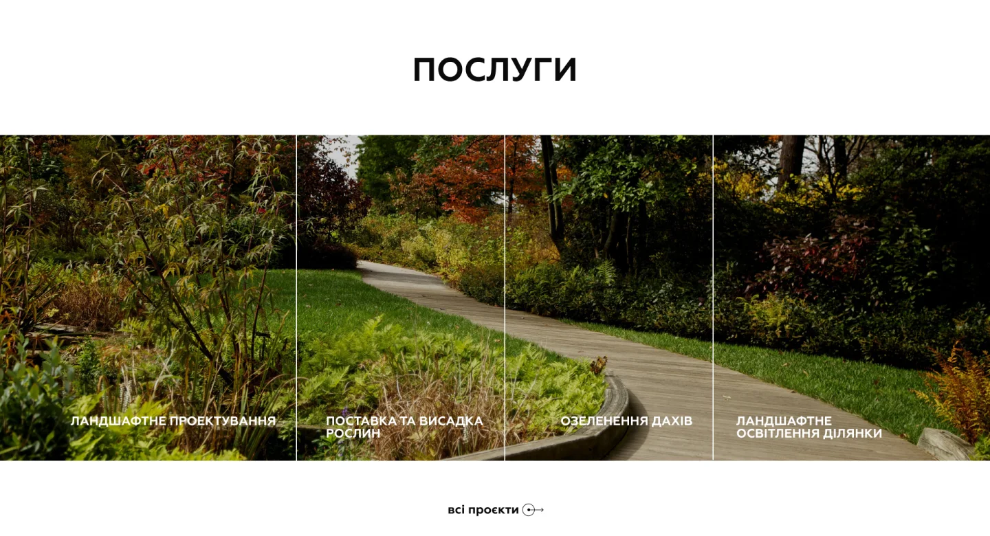
The “Services” block is a wide strip of four photos separated by thin vertical lines. At the bottom of each column is the name of a service:
- landscape planning;
- plant supply and planting;
- green roofs;
- landscape lighting for the grounds.
What makes the block stand out is how it reacts to the cursor. Hover over a service name and the photo changes, while a description of the service and a button appear on top. The landscape lighting text, for example, explains that the company’s specialists plan, assemble and install lighting in Kyiv, including on large plots and for unusual requirements. One block thus holds four short stories, and the page stays light. Below the strip, an “All projects” link leads to the page with every service.
About the company, figures and blog
The “About us” block sits on a light background with a subtle pattern: a wide photo of a garden in bloom, overlaid with a semi-transparent card about a team of enthusiasts who want to make Ukrainians’ living space more comfortable, plus a “Get in touch” button. It is followed by the company’s four figures in large green type: 13 years on the market, 150 clients, 120 specialists and 500 projects. The figures are animated and come to life when the block scrolls into view.
Next is the dark “Blog” block: three article cards with a photo, heading, date and teaser, and an “All articles” link. After it comes a green “Book a free consultation” card with a button, set against pale silhouettes of grasses. This call-to-action block is animated too and is repeated on the inner pages, so the way to an enquiry is always close at hand.
Portfolio, team and reviews
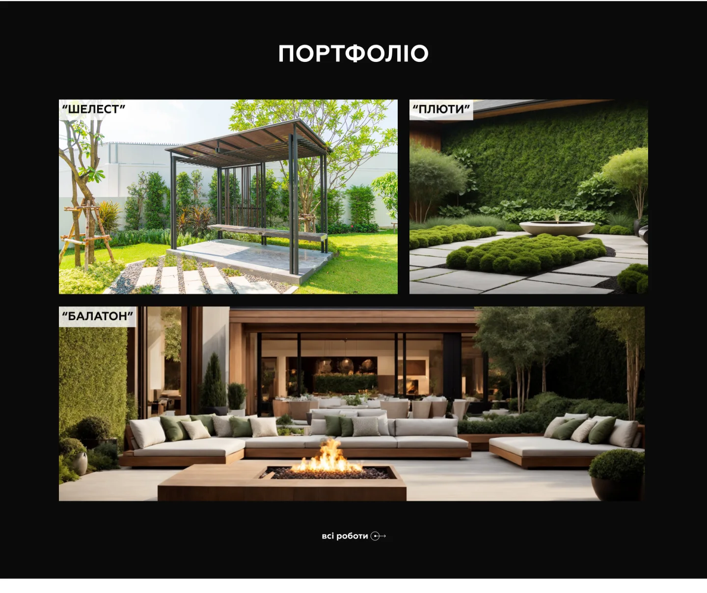
The portfolio on the home page is a dark section with three projects: two shots in the top row and a wide image below, each with the project name on a light label. The block is animated, and the “All work” link leads to the portfolio page. Then comes “Our team”: a slider with photos of staff in company uniform, their names and job titles, which you browse with arrows.
Client reviews sit on a photo of an avenue of clipped shrubs: two semi-transparent cards with a quotation-mark icon, the text and the author’s name. The home page ends with the “Contact us” block – a green card with “Surname”, “Phone”, “Email” and “Message” fields, a consent tick box for processing personal data and a black button. Like the reviews, the form appears with an animation.
Services and a filterable portfolio
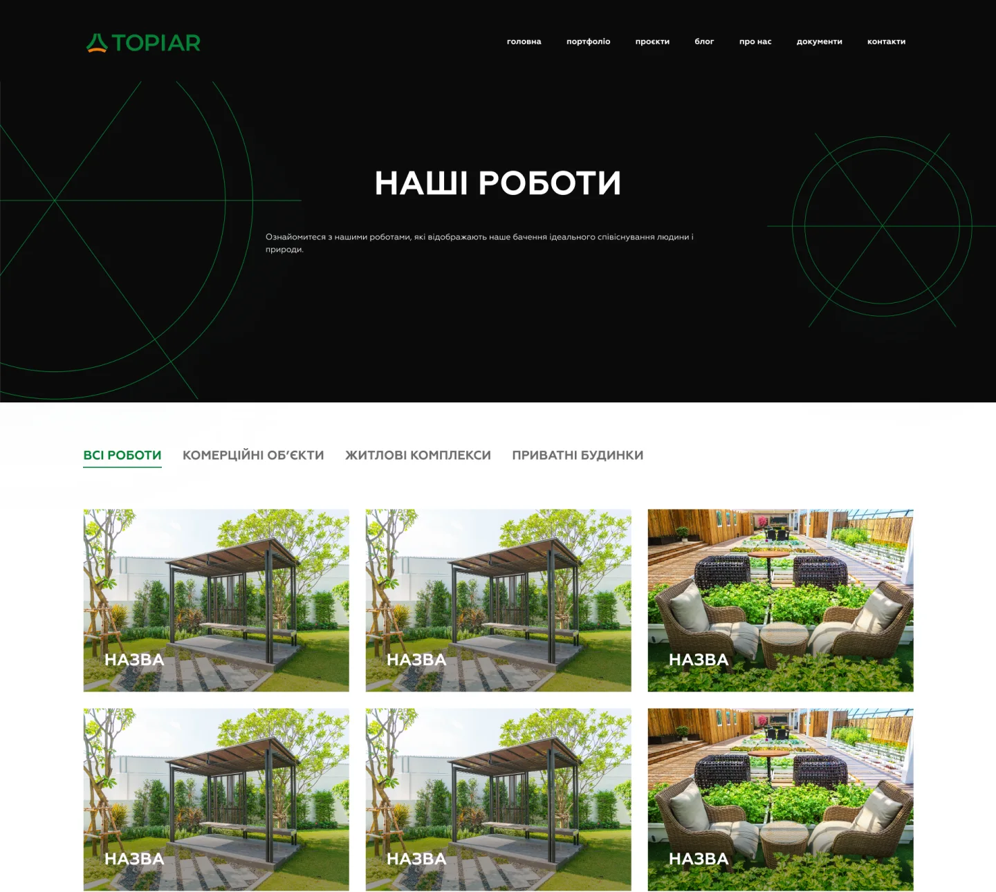
The inner pages open with a dark top block containing a heading, a short introduction and the same line art. The services page is a grid of cards with a photo and a name. The “Our work” page is built the same way, but above the grid there is a filter by type of project:
- all work;
- commercial properties;
- residential complexes;
- private houses.
The active tab is underlined in green, and below the grid there is pagination with arrows. Further down the page come reviews and the free consultation block, so a visitor who has just browsed the work can send an enquiry straight away.
The project page goes into detail: an “About the project” section, the team that worked on it, the area, the status and a description of how the work went. The service page opens with a large photo and the service name, followed by an introduction and a list with icons, three benefits – “Client wishes met 100%”, “Always available online”, “A better quality of life” – and a description section where photos and text alternate in a staggered layout.
Blog, “About us”, contacts and privacy policy
On the blog, articles can be filtered by category, and each card has a photo, date and teaser. The article page has a heading, date, text with subheadings and a table of contents. The “About us” page covers the organisation’s mission and vision, contacts have a page of their own, and the privacy policy includes the date of the last update and sections on cookies. The footer holds the logo, a menu with a sitemap, social media icons and a link to the policy.
What matters on a landscaping company’s website
Landscaping is expensive and takes time, so clients choose a contractor very carefully. Based on this project, a website for such a company works when:
- photos of the work are large – a garden, terrace or green roof should fill the screen, not hide in thumbnails;
- the portfolio is split by type of project – a homeowner does not need to scroll through commercial work, and a developer does not need private gardens;
- each project page shows the area, status and team – it makes the work real and verifiable;
- services are described briefly, with details revealed on request – as in the services block that opens on hover;
- animations support the content rather than get in its way: figures, reviews and the form come to life as you scroll;
- a consultation request is available from every page and takes just four fields.
If you work in landscaping, greening or construction, start your website by asking what clients want to see before they call. Most often it is finished projects, clear services and the people who will work on their property. Then your website becomes more than a business card – it becomes a showcase that brings in enquiries.
Project details
Project typenew website
CategoryBusiness website
TechnologiesHTML5, CSS3, JavaScript
Rolewebsite development: page build, block animations, services revealed on hover, portfolio filter and pagination, team slider and enquiry forms
ClientTOPIAR (“Happy Country” non-profit)
CountryUkraine
What was done
- Built ten page types: home, services, service page, portfolio, project page, blog, article, “About us”, contacts, privacy policy
- Created a shared header with menu and a footer with menu, social media links and a link to the policy
- Built the home page’s first screen with a round “lens”, the organisation’s name and a “Get in touch” button
- Animated the home page blocks: first screen, “Mission”, company figures, call to action, portfolio, reviews and contact form
- Created the services block where hovering over a name swaps the photo and reveals a description and button
- Built the “Our work” page with a filter by type of project and pagination
- Built the project page (about the project, team, area, status, progress) and the service page with benefits
- Created the team slider, the reviews block and the blog feed with a category filter
- Built the “About us” page with animated mission and vision blocks, the contacts page and the privacy policy
- Created the contact form with required fields and data processing consent, plus the “Book a free consultation” block
Result
- A corporate website for a landscaping company that shows its work in large photos
- An animated home page and services that open on hover
- A portfolio filtered by type of project, with detailed project pages
- Blog, team, reviews and a page on the organisation’s mission
- A free consultation request from any page